TABLE OF CONTENTS
- DA-103
- Topic 1: Getting Started with DA-103
- Topic 2: Visualizing Data with Pandas and Matplotlib
- Topic 3: Cleaning and Preparing Real-World Data
- Topic 4: Exploratory Data Analysis(EDA)
- Topic 5: Churn Analysis with Advanced Visuals
- Topic 6: Analyzing Product-Level Churn Trends
- Topic 7: Financial Metrics and Customer Feedback
- Topic 8: Solving Business Problems with Data
- Topic 9: AI in Data Analytics & Review Analysis
DA-103
Sprint summary
Getting Started
Topic 1: Getting Started with DA-103
- Introduction to DA-103
Let’s move beyond spreadsheets and dive into real-world datasets. DA-103 introduces you to the power of structured data analysis using Python and SQL, preparing you for full-scale data projects.
What is it?
DA-103 focuses on working with databases, dataframes, and analytical workflows to solve domain-specific problems.
Where is it used?
Used in analytics teams working with customer, operational, or product data across domains like transport, banking, and retail.
How is it used?
• Build queries with SQL to fetch and filter data
• Use Python libraries like Pandas for transformation and visualization
• Practice through real-world datasets such as Uber rides and banking attrition
• Focus on drawing actionable insights from patterns
--- Takeaways / best practices
• Understand the business domain of your dataset
• Combine SQL and Pandas for efficient data handling
• Keep your code modular and reusable for analysis blocks
• Focus on insights, not just charts
- SQL and Pandas
When SQL meets Pandas, it becomes a powerful duo for analytics. SQL is great for fetching data from structured sources, while Pandas makes it flexible to transform and explore.
What is it?
A blended approach of using SQL for querying and Pandas for post-processing and analysis in Python.
Where is it used?
In data pipelines, dashboards, business intelligence reports, and any scenario where raw data needs cleaning and analysis.
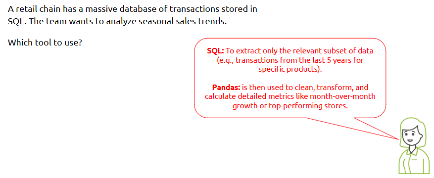
Scenario 1: Detailed in-Memory Analysis:
Scenario 2: Joining Tables:
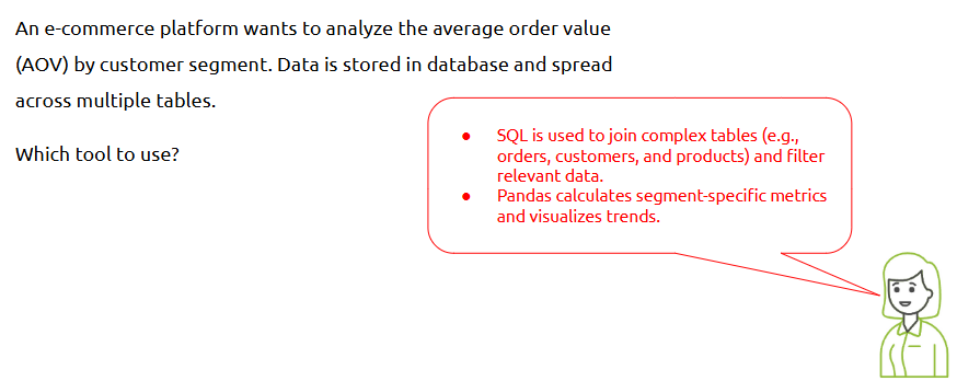
How is it used?
• Use SQL (via SQLite or databases) to extract relevant data
• Load SQL results into a Pandas DataFrame using pd.read_sql_query()
• Perform filtering, grouping, and visualization in Pandas
• Combine multiple queries and DataFrames for deeper analysis
Summary:
--- Takeaways / best practices
• Always limit/select only required fields in SQL
• Use Pandas after SQL for flexibility and readability
• Avoid redundant transformations — choose the right tool for the step
• Index your data when using joins or merges in Pandas
- Bank attrition Analysis
Why do customers leave a bank? Attrition analysis helps uncover behavioral and demographic patterns that influence churn, helping institutions retain their clients.
What is it?
A real-world case study using customer data to analyze and predict churn.
Where is it used?
Common in finance and customer success teams for retention strategy and predictive modeling.
Practice Problem:
Dataset to be used - Link
Problem Statement:
Objective:
Key Metrics Involved:
--- Takeaways / best practices
• Look for patterns in demographics, tenure, and transactions
• Check data balance — is churn a minority class?
• Use correlation heatmaps to guide variable selection
• Don’t forget to document business implications of your insights
Topic 2: Visualizing Data with Pandas and Matplotlib
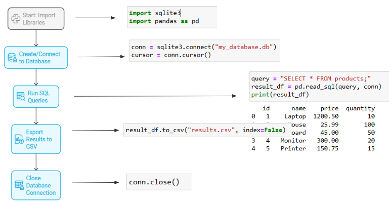
- Importing Data using SQLite
Working with real-world data often means querying structured databases. SQLite offers a lightweight and efficient way to do this directly in Python.
Unlike traditional databases, it does not require a separate server process, making it ideal for local data storage.
What is it?
SQLite is a self-contained SQL database engine often used to store and query relational data locally.
Where is it used?
In projects needing small-scale relational storage, quick prototyping, and local querying (e.g., apps, internal tools, bootstrapped dashboards).
What makes SQLite different from SQL:
How is it used?
• Use Python’s sqlite3 library to connect to the database
• Write SQL queries to fetch data
• Use pandas.read_sql_query() to load the results into a DataFrame
Example:
--- Takeaways / best practices
• Always close your database connection after use
• Filter data at the SQL level when possible to reduce memory load
• Use SQL joins to combine multiple tables before loading into Pandas
- Visualization in Pandas
Pandas makes it surprisingly simple to go from DataFrame to basic plots with minimal code.
What is it?
Pandas has built-in .plot() functionality powered by Matplotlib for quick visualizations.
Where is it used?
Ideal for rapid exploratory data analysis and creating visuals directly from tabular data.
How is it used?
• Use .plot(kind='line'/'bar'/...) on Series or DataFrame objects
• Customize title, labels, and colors with simple arguments
• Combine with grouping or pivoting for insightful plots
--- Takeaways / best practices
• Use value_counts() or groupby() before plotting for better insights
• Add titles and axis labels to improve readability
• For customization beyond basic charts, switch to Matplotlib
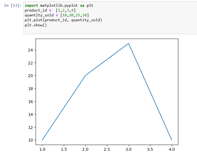
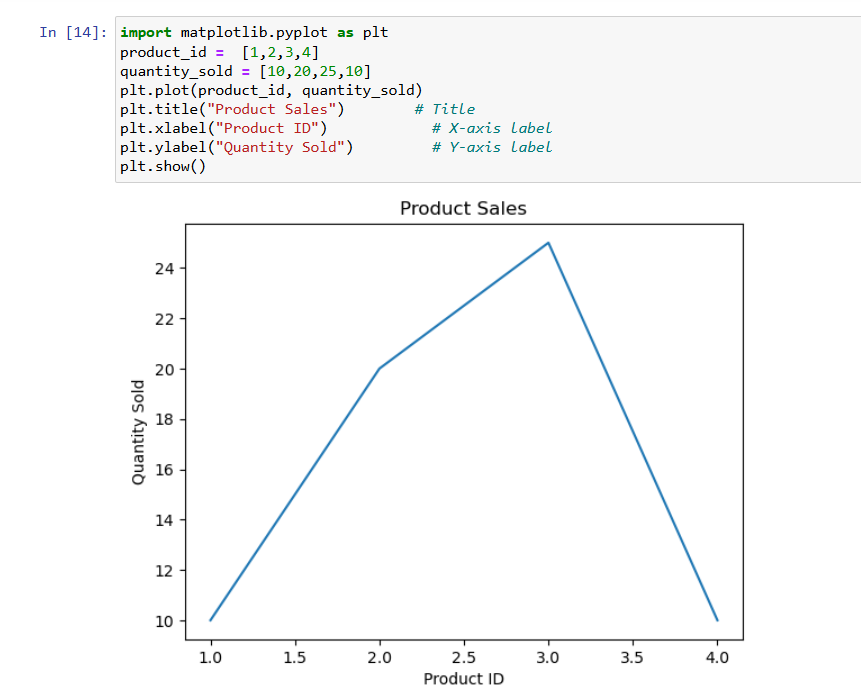
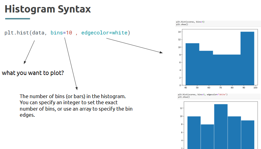
- Intro to Matplotlib
Matplotlib is the foundation for most Python visualizations — it gives you full control over your plots.
What is it?
A 2D plotting library used for generating static, animated, or interactive visualizations.
Where is it used?
Across domains in Python-based analytics, reporting, and dashboards.
Syntax:
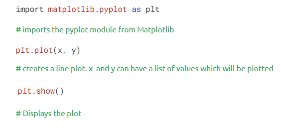
How is it used?
• Import matplotlib.pyplot as plt
• Use plt.plot(), plt.bar(), plt.scatter() to create charts
• Call plt.show() to display the plot
Example:
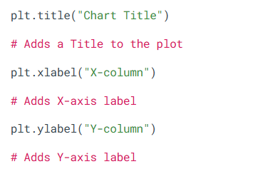
--- Takeaways / best practices
• Always include plt.title(), plt.xlabel(), and plt.ylabel()
• Use plt.grid(True) to improve chart readability
• Combine with subplots for comparative visuals
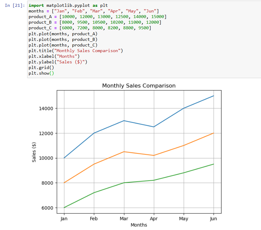
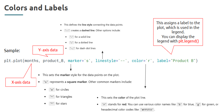
- Customizing Plots
Customization transforms your charts from raw output to polished insights.
What is it?
The process of modifying visual elements like color, style, labels, and size in a chart.
Where is it used?
In dashboards, reports, and presentations to match audience needs and highlight key data points.
How is it used?
• Customize color using color='green'
• Add legends with plt.legend()
• Set figure size using plt.figure(figsize=(width, height))
• Use markers, line styles, and annotations to enhance the message
Example:
Note:
Line Plot for Multiple Product Sales:
--- Takeaways / best practices
• Consistency in colors and labels improves clarity
• Use legends only when multiple series are plotted
• Limit over-customization that may distract from data
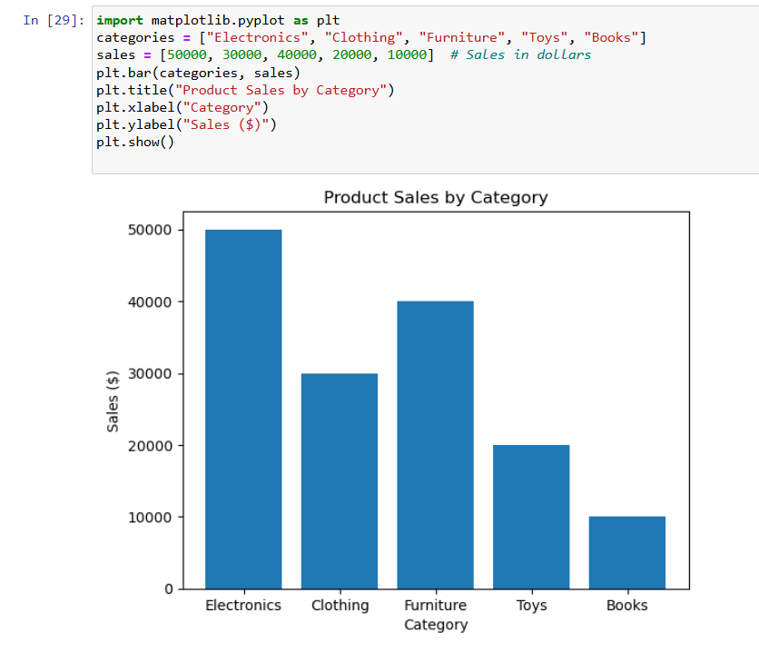
- Creating Basic Plots
Creating simple visualizations is a vital part of quick data storytelling.
What is it?
Generating standard chart types like bar, line, and scatter plots using Matplotlib or Pandas.
Where is it used?
At every stage of data analysis — especially EDA and final presentations.
How is it used?
• Choose chart type based on data (e.g., bar for categories, line for trends)
• Use .plot(kind='bar'), plt.bar(), or plt.scatter() as needed
• Label axes, title, and apply suitable styles
Example:
Create Bar chart for Product Sales
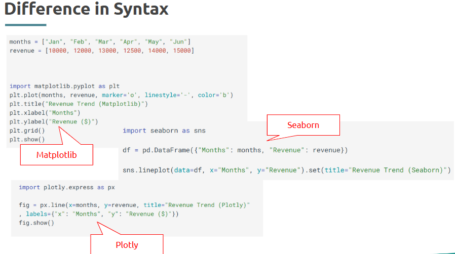
Matplotlib, Seaborn and Plotly:
--- Takeaways / best practices
• Pick the right chart for your data type
• Avoid 3D and overly colorful visuals unless necessary
Topic 3: Cleaning and Preparing Real-World Data
This is the dataset to be used:
Contains around 15k rows of data
Is stored in CSV file
- Importing Data
Before any analysis begins, data needs to be loaded into your environment correctly and efficiently.
What is it?
Importing data means reading files (like CSV, Excel, or SQL) into Python for further processing.
Where is it used?
Every step of analytics begins with bringing in the data — whether from local files or databases.
How is it used?
• Use pd.read_csv() to load CSV files
• Use pd.read_excel() for Excel spreadsheet
Recap: Data Import using Pandas
Recap: Skipping Rows
Example:
--- Takeaways / best practices
• Always verify file encoding and separators
• Preview with .head() and .shape() after importing
• Handle parse dates and missing values right during import if possible
- Data Cleaning
Raw data can be messy. Cleaning ensures it’s usable, accurate, and structured for insights.
What is it?
Data cleaning involves correcting or removing bad, missing, or inconsistent entries.
Where is it used?
Used in every domain to ensure high data quality before visualization or modeling.
How is it used?
• Drop irrelevant rows/columns
• Replace or fill nulls
• Remove duplicates
• Fix incorrect formats
--- Takeaways / best practices
• Always check for nulls, duplicates, and invalid entries
• Cleaning improves accuracy and trust in your analysis
• Save checkpoints while cleaning large datasets
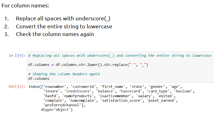
- Fixing Column Names
Column names often come in irregular or messy formats — which impacts readability and coding.
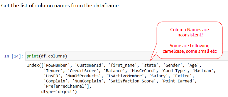
What is it?
Standardizing column names to be clean, lowercase, and consistent.
Where is it used?
In dataframes used for scripting, automation, and modeling.
How is it used?
• Strip white spaces
• Convert to lowercase
• Replace spaces with underscores
--- Takeaways / best practices
• Always clean column names right after import
• Avoid spaces and capital letters in column names
• Use meaningful, readable names for clarity
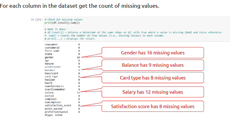
- Handle Missing data
Missing values can silently distort your analysis — they need special attention.
What is it?
Handling missing data means either removing or replacing NaN or null values.
Example:
Where is it used?
Common in survey data, logs, financial records, and customer data.
How is it used?
• Check missing values using isnull().sum()
• Use dropna() to remove rows with missing values
• Use fillna() to fill with a default or statistical value
Example:
--- Takeaways / best practices
• Don’t blindly drop — understand the context of missing values
• Use domain knowledge to decide how to impute
• Missing values can sometimes carry useful signals
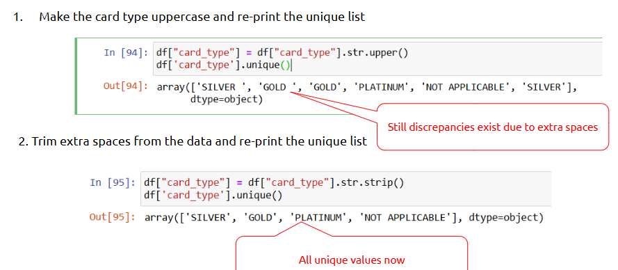
- Data Consistency Issues
Inconsistent formats, spellings, or cases in data lead to poor grouping and analysis.
What is it?
Data consistency issues occur when the same value appears in different formats (e.g., "Male", "male", "MALE").
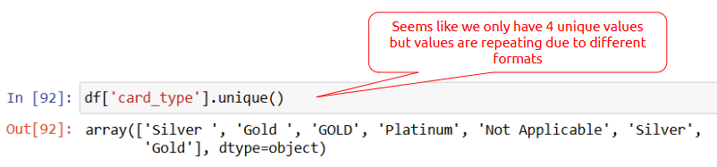
How is it used?
• Use str.lower() or str.upper() for uniformity
• Replace known variations using .replace()
• Check unique values with df['col'].unique()
Fix Inconsistent Data:
--- Takeaways / best practices
• Standardize as early as possible in the pipeline
• Always check unique values for key columns
• Use dictionaries for efficient replacements
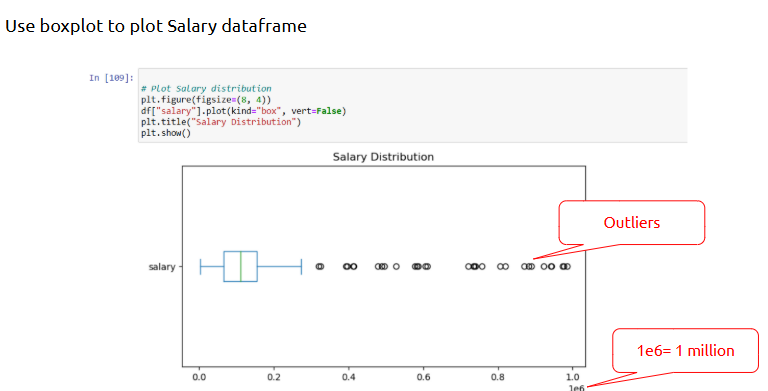
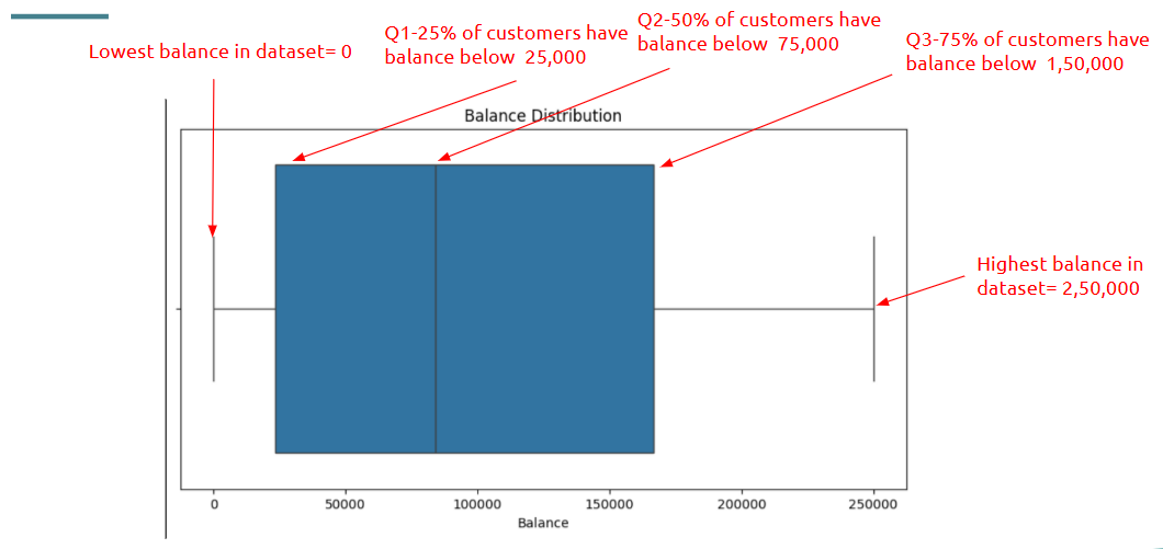
- Detecting Outliers
Outliers can skew your analysis and often signal anomalies or errors.
What is it?
Outliers are values that are significantly higher or lower than the rest of the data.
Where is it used?
In customer spending, sensor data, fraud detection, etc.
How is it used?
• Use IQR (Interquartile Range) method
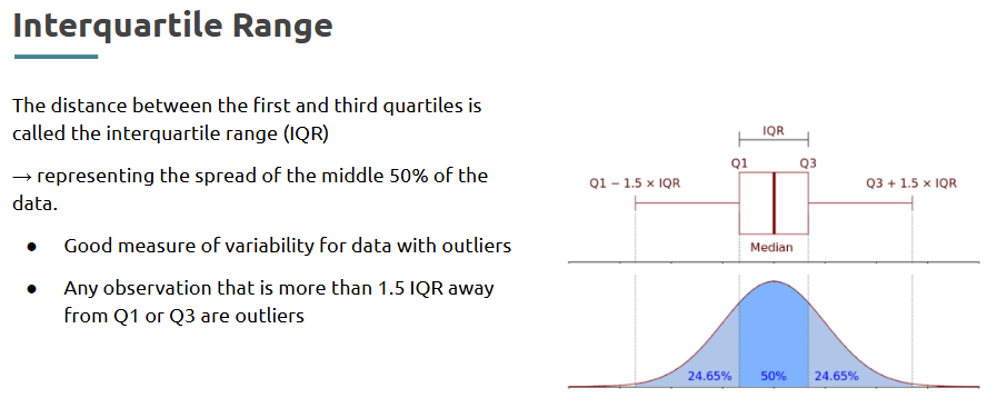
• Use visualization: boxplot
Boxplot:
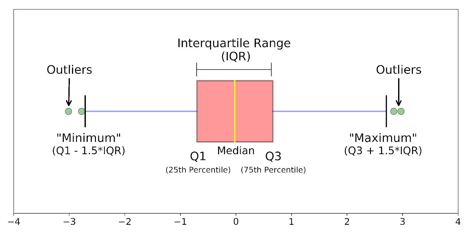
Example:
--- Takeaways / best practices
• Visuals are often the best way to spot outliers
• Treating outliers depends on context: fix, remove, or keep
• Document assumptions while removing them
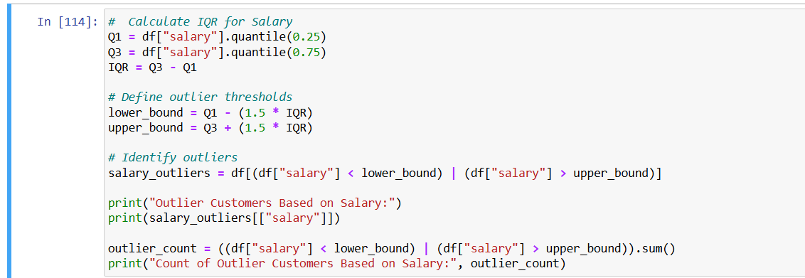
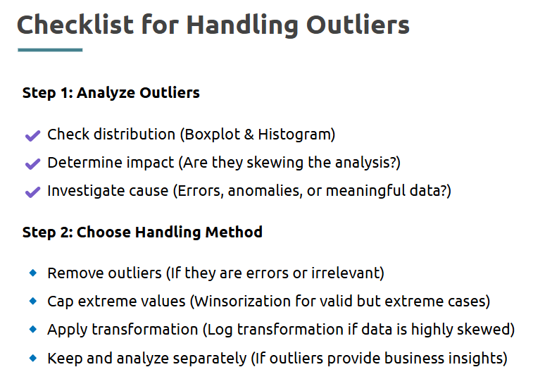
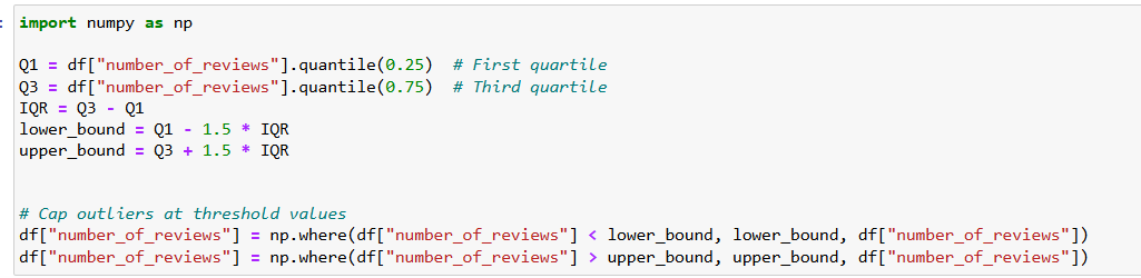
- Handling Outliers
Once detected, outliers must be addressed carefully depending on the data’s purpose.
What is it?
The process of adjusting, capping, or removing extreme values from the dataset.
Where is it used?
Crucial before modeling or summarizing data, especially in sensitive domains.
How is it used?
• Remove rows containing outliers
• Cap values using quantiles (winsorization)
• Transform values using log or square root
Example (Use IQR method to list Salary Outliers):
--- Takeaways / best practices
• Never handle outliers without understanding why they exist
• Try visualizing before and after cleaning
• Outliers might be valid — validate with domain experts when unsure
Topic 4: Exploratory Data Analysis(EDA)
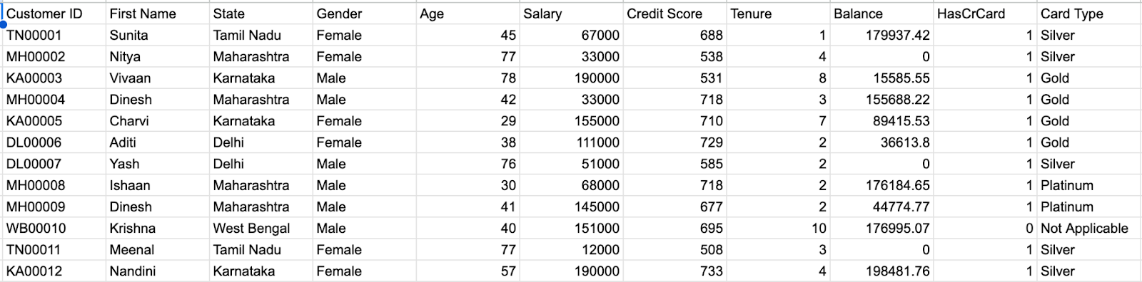
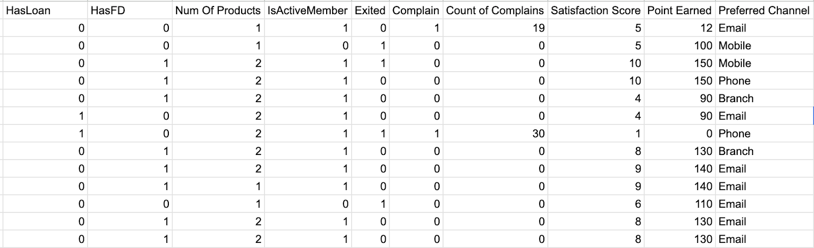
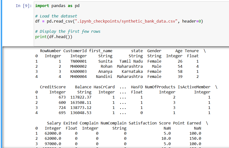
- Working on Bank dataset
Working with a real-world dataset helps bring context to statistical patterns and customer behavior.
What is it?
An exercise using actual customer data from a bank to analyze churn, demographics, and financial activity.
Where is it used?
In business analytics, customer retention modeling, and financial forecasting.
How is it used?
• Load the dataset using pd.read_csv()
• Explore customer profiles, balances, and account activity
• Clean and transform data
• Use this dataset as the foundation for EDA and feature engineering
--- Takeaways / best practices
• Understand business context before diving into analysis
• Start by exploring key features like age, balance, and churn label
• Visualize categorical and numerical fields separately
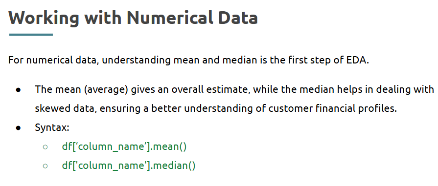
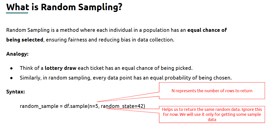
- Performing Basic Exploratory Data Analysis (EDA)
EDA helps you “talk” to the data and understand its structure, patterns, and oddities.
What is it?
A structured process to summarize main characteristics of data before any modeling.
Where is it used?
In every data project to get a sense of distribution, outliers, and trends.
How is it used?
• Use .info() and .describe() for structural overview
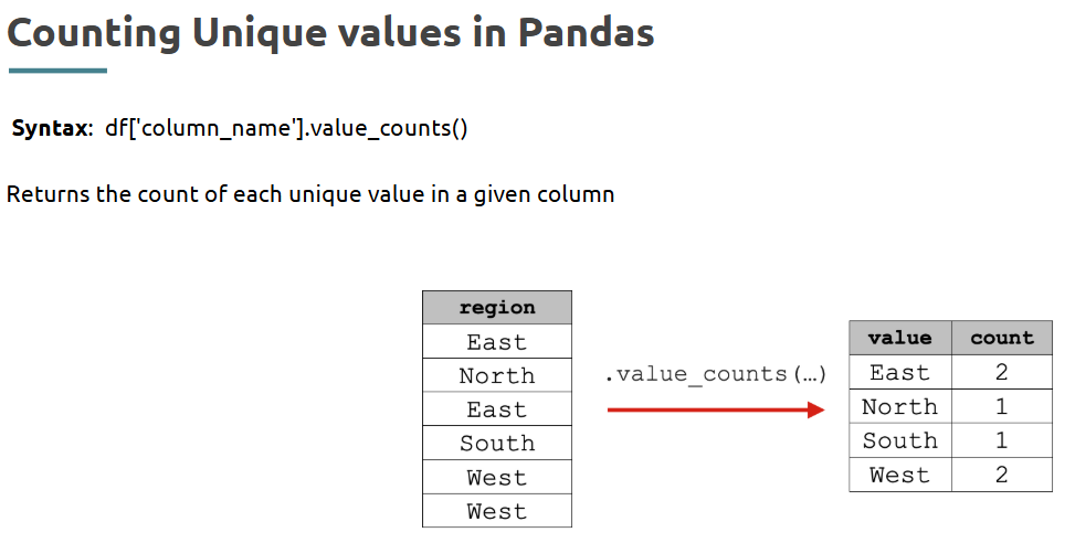
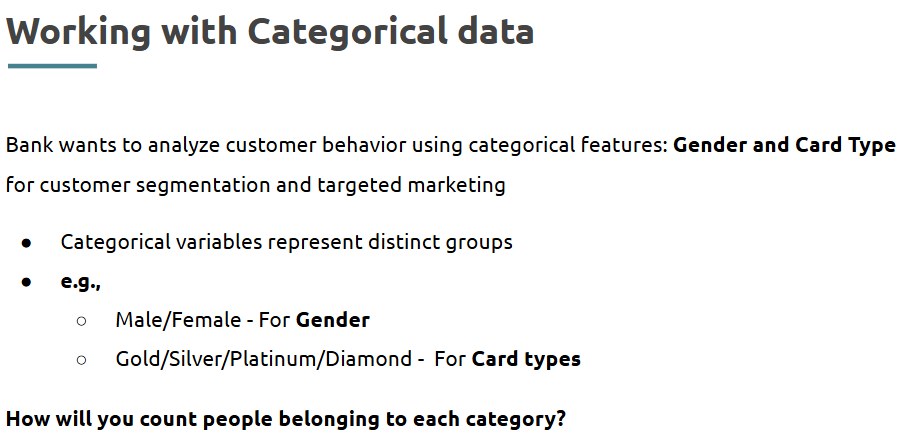
• Use .value_counts() to understand categories:
• Plot histograms, bar charts, and box plots for visual insights:
--- Takeaways / best practices
• Use .describe(include='all') for both numeric and categorical insights
• Summarize findings after each round of EDA
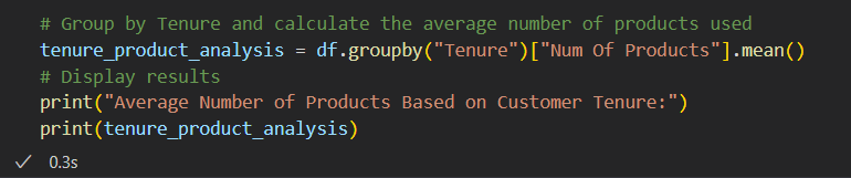
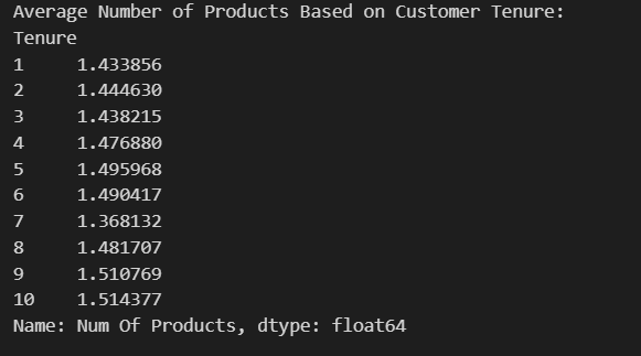
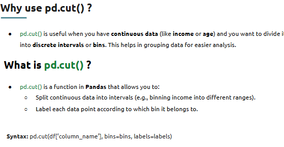
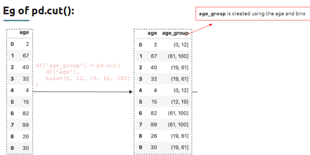
- Feature engineering
What is it?
Where is it used?
Widely used in machine learning, reporting automation, and performance segmentation.
How is it used?
• Combine features (e.g., total balance = savings + credit)
• Derive new ones (e.g., tenure buckets, spending categories)
Example:
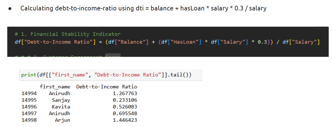
Adding new features:
Output:
--- Takeaways / best practices
• Features should be interpretable and relevant
• Normalize or scale if required by algorithms
• Don’t create redundant or highly correlated features
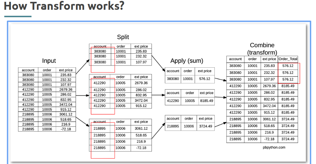
- Using transform()
When you want to apply a function while keeping the shape of the data intact, transform() is your friend.
What is it?
A Pandas method that applies a function to each group and returns a Series with the same index.
Where is it used?
In group-based operations where you need the transformed result to align with the original structure.
Syntax:
How is it used?
• Use inside groupby() to compute metrics per group
• Apply standardization or custom functions within each group
Example:
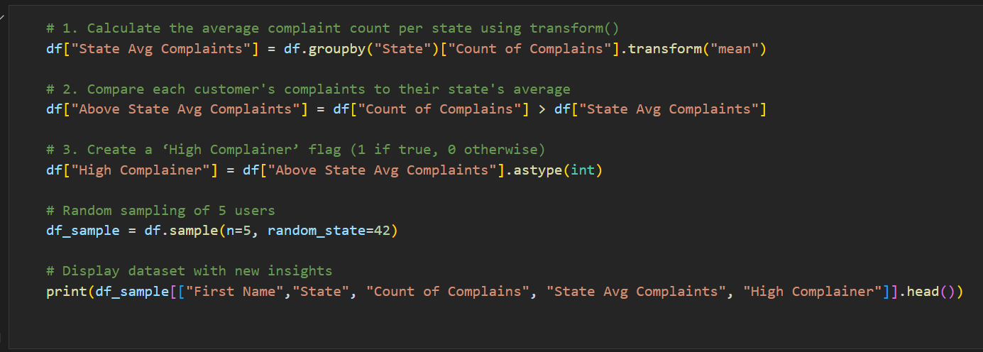
--- Takeaways / best practices
• Use transform() when you want to keep original row-level details
• Works great for per-group normalization
• Prefer transform() over apply() when returning same-sized output
- Correlation Between Variables
Understanding how features relate to each other is key to preventing redundancy and building better models.
What is it?
Correlation measures the degree to which two variables move together.
Where is it used?
In feature selection, multicollinearity detection, and statistical reporting.
How is it used?
• Use .corr() on DataFrame to get the correlation matrix
• Visualize with heatmaps for easier pattern recognition
Example:
--- Takeaways / best practices
• Focus on variables with strong correlations (+/- > 0.5)
• Use heatmaps to filter top correlations visually
• Watch for highly correlated inputs in predictive models
- Univariate, Bi-variate and Multivariate analysis
Data analysis can be classified into three main types based on the number of variables being analyzed:
Univariate Analysis → Examines a single variable.
Bivariate Analysis → Examines the relationship between two variables.
Multivariate Analysis → Examines the relationship among three or more variables.
Where is it used?
In hypothesis testing, EDA, feature exploration, and visual storytelling.
How is it used?
• Univariate: use hist(), value_counts()
• Bivariate: use scatter(), groupby(), corr()
• Multivariate: use pairplots, heatmaps, and regression plots
Example(bivariate):
--- Takeaways / best practices
• Start from univariate to multivariate for deeper insights
• Use visual and statistical tools side by side
• Capture interactions — not just individual trends
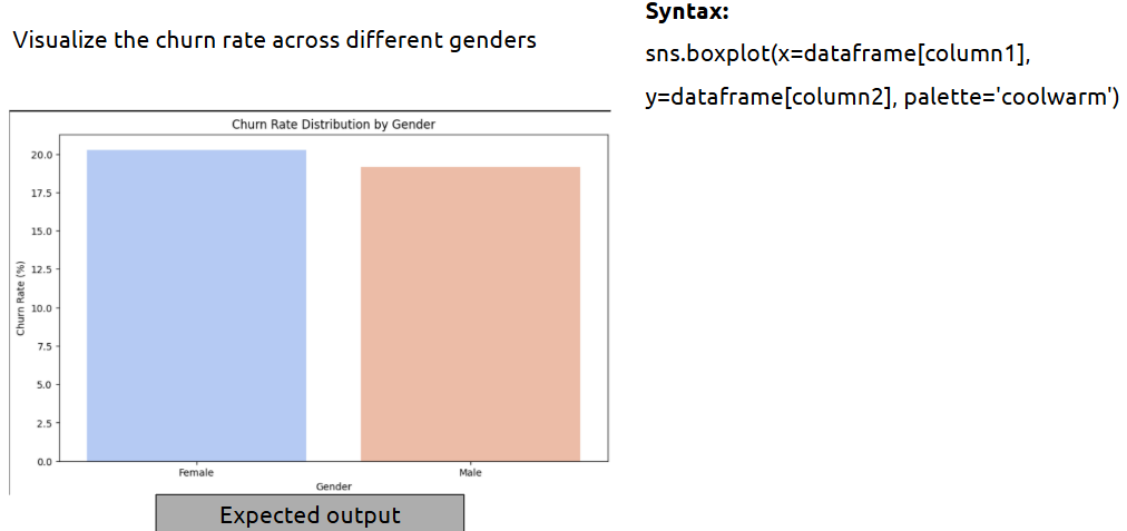
Topic 5: Churn Analysis with Advanced Visuals
- Working on Bank dataset - Demographic related churn data
To better understand why customers leave, analyzing demographic patterns is critical.
Bank Dataset: Link
What is it?
This involves using customer age, gender, marital status, income, and similar features to detect churn behavior patterns.
Where is it used?
In customer segmentation, retention strategy design, and churn prediction.
How is it used?
• Filter or group data based on demographic features
• Compare churn rates across gender, age groups, and income levels
• Use summary tables and bar plots to show variation
--- Takeaways / best practices
• Always explore churn by categories like gender, age, marital status
• Use normalized percentages to avoid volume bias
• Combine demographic data with product usage for better insights
- Univariate analysis
This helps you look at individual variables to understand their distribution and characteristics.
What is it?
Analysis of a single variable whether numeric or categorical — to observe patterns, extremes, or imbalance.
Where is it used?
Used early in EDA to evaluate variables before exploring relationships.
How is it used?
• Use value_counts() for categorical features
• Use histograms or boxplots for numerical features
• Check for skewness, outliers, and frequency distribution
--- Takeaways / best practices
• Helps determine if transformation or binning is needed
• Identify outliers visually before deciding how to treat them
• Use boxplots when comparing distributions
Example:
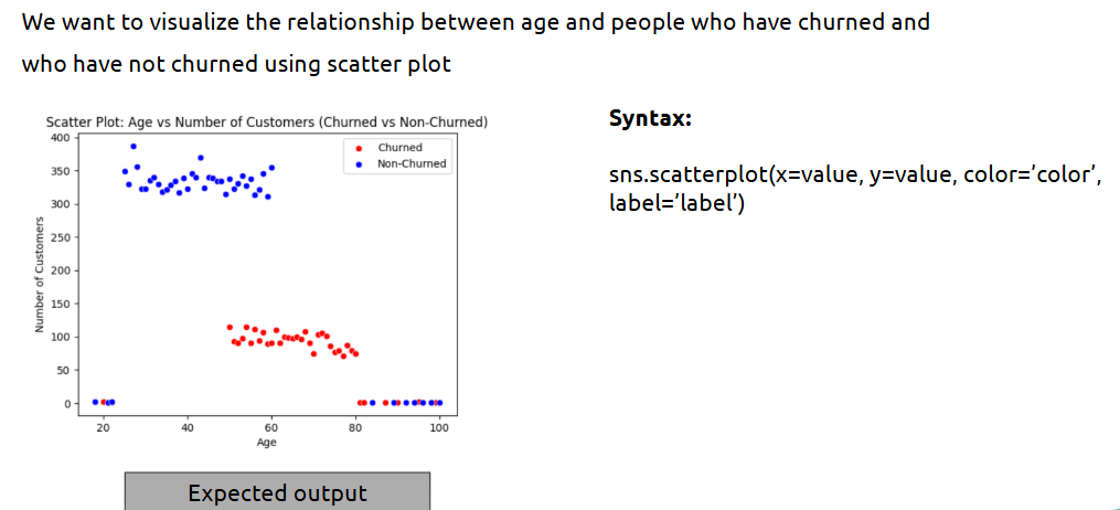
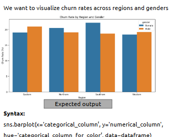
- Bivariate analysis
Here we explore how two variables are related — e.g., gender vs churn, age vs income.
What is it?
Analysis of the relationship between two variables, typically dependent vs independent.
Where is it used?
Common in identifying influencers of churn, pricing impact, or campaign response.
How is it used?
• Use groupby() and mean() for numerical trends
• Use scatter plots or bar plots for categorical comparisons
• Use correlation matrix for continuous variables
--- Takeaways / best practices
• Focus on churn differences across segments
• Visualize comparisons using grouped bar plots
• Watch for misleading averages — always check variance
Example:
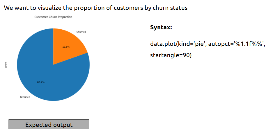
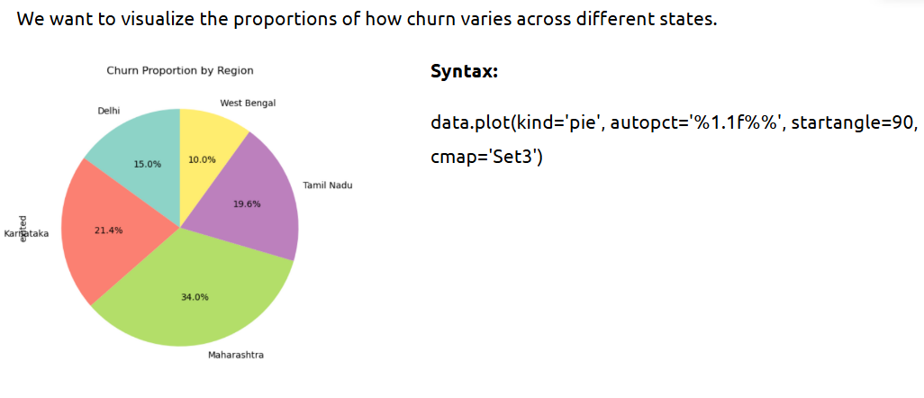
- Visualization with matplotlib and seaborn
These libraries allow deep, beautiful, and customized static visualizations.
What is it?
Matplotlib is a base Python plotting library; Seaborn builds on it for statistical plots.
Where is it used?
Widely used in data analysis notebooks, dashboards, and presentations.
How is it used?
• Use Matplotlib for line, bar, and pie charts
• Use Seaborn for distributions, boxplots, heatmaps
• Customize themes, colors, and layouts easily
How can we give custom labels for each ?
--- Takeaways / best practices
• Use Seaborn for better visuals and less code
• Always label axes and titles clearly
• Save plots with plt.savefig() for reuse
- Interactive visualization using plotly
Static plots tell stories; interactive plots allow your audience to explore those stories.
What is it?
Plotly is a library that creates dynamic, web-based interactive charts like sliders, zooms, and hover data.
Where is it used?
Ideal for dashboards, reports, and live data tools.
How is it used?
• Use plotly.express for quick plots
• Embed in web apps using Dash or notebooks
Example:
--- Takeaways / best practices
• Use for large datasets to explore deeper interactions
• Customize tooltips and colors for better storytelling
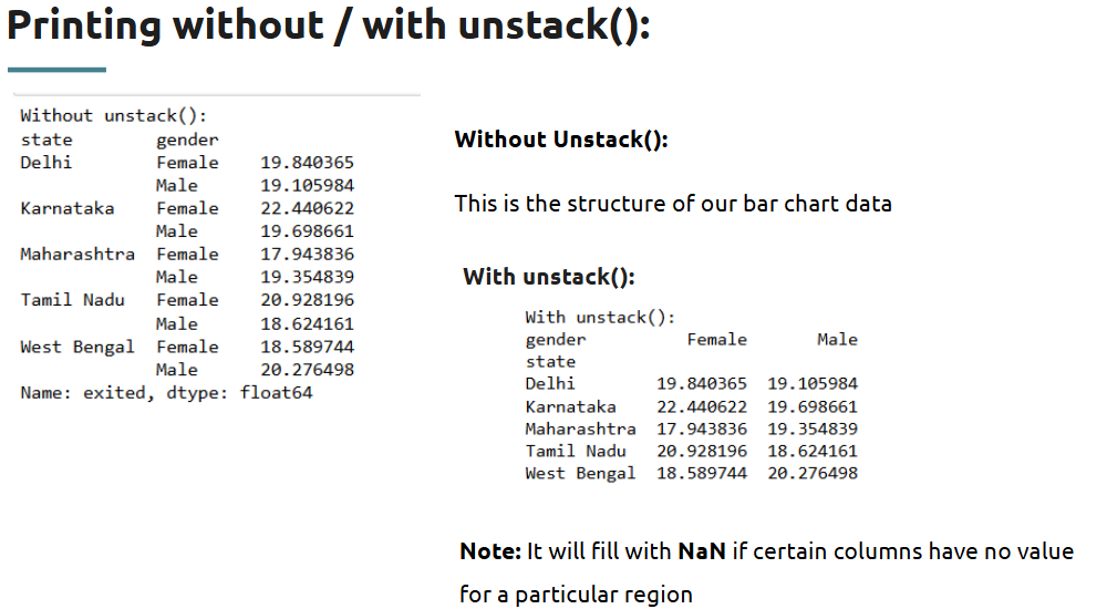
What is unstack() ?
Topic 6: Analyzing Product-Level Churn Trends
- Product related churn analysis
When a customer stops using a product — like a credit card or savings account — it’s essential to know which product and why. This helps businesses refine offerings and retain users.
What is it?
Product-related churn analysis involves examining usage patterns across various products (e.g., credit cards, loans, online services) to identify features driving churn.
Where is it used?
Used heavily in banking, telecom, e-commerce, SaaS platforms, and insurance to identify underperforming products or services leading to customer loss.
How is it used?
• Identify product-specific columns (e.g., Total_Trans_Ct, Credit_Limit, Card_Category)
• Compare metrics across churned vs non-churned groups
• Use bar plots or pivot tables to visualize product usage patterns
• Group by product features and analyze churn percentage
Why is product related churn analysis important ?
Example:
# Calculate churn rate by card category
churn_rate = df.groupby('Card_Category')['Attrition_Flag'].value_counts(normalize=True).unstack()
print(churn_rate)
Output (sample):
This shows higher attrition rates in premium products like Platinum and Gold, suggesting they may not be meeting customer expectations.
Takeaways / best practices
• Compare product features with churn labels to find hidden trends
• Consider creating new variables like “product engagement score”
• Use visuals (grouped bars, pie charts) to share insights with business teams
• Always map churn back to business value — not all churn is equal
Topic 7: Financial Metrics and Customer Feedback
- Financial and Feedback analysis
Understanding how customers spend and what they feel about the service gives a 360° view of why they stay — or leave.
What is it?
Financial and Feedback analysis combines transactional metrics (spending, credit limit, income) with subjective input (feedback, complaints, satisfaction).
Where is it used?
Used in churn prediction, customer satisfaction tracking, and service quality optimization — especially in banking, e-commerce, and telecom industries.
How is it used?
• Analyze key financial indicators like Credit_Limit, Total_Revolving_Bal, Total_Trans_Amt
• Compare churned vs non-churned on financial performance
• If feedback data exists (e.g., survey scores, complaints), apply sentiment analysis or frequency counts
• Use groupby() and describe() for financial summaries
• Visualize trends over churn, income brackets, or transaction levels
Takeaways / best practices
• Always normalize financial data (e.g., per customer or per month) for fair comparison
• Use outlier detection to remove unusually high-value accounts that may skew averages
• Combine numerical and textual insights (if available) for better churn profiling
• Financial analysis alone isn’t enough — it should be paired with customer behavior or sentiment
Topic 8: Solving Business Problems with Data
- Understanding Data and Problem Statement
Before jumping into analysis, you must clearly understand what problem you’re solving and what data you're working with.
What is it?
Interpreting the business challenge and aligning it with the available dataset.
Where is it used?
In any analytics or machine learning project — to make sure the solution fits the actual business need.
How is it used?
• Review the dataset: what each column means
• Identify the target variable (e.g., churn, revenue)
• Align data fields with business context
• Formulate the key questions (e.g., What influences churn? What predicts purchase?)
--- Takeaways / best practices
• Never begin without defining the problem clearly
• Look at business metrics, not just columns
• Ask: What decision will this analysis support?
Example:
Data Analyst @Airbnb
First, What is Airbnb?
Online platform for listing, discovering, and booking accommodations.
Business Model: Connects hosts offering short-term rentals with travelers.
Listing Types: Entire homes, private rooms, shared rooms.
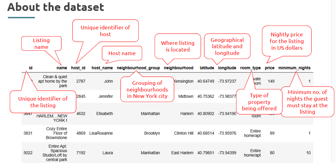
The problem statement to work around!
- Load and Explore the Data
The first technical step in any project — get the data into your workspace and inspect it thoroughly.
What is it?
Reading the dataset and performing an initial scan to understand structure and quality.
Here’s the dataset to be used.
Where is it used?
First phase in every analytics pipeline — EDA begins here.
How is it used?
• Use pd.read_csv() or similar to load data
• Check .shape, .head(), .info()
• Use .describe() to summarize numerical fields
• Check for data types and null values
--- Takeaways / best practices
• Always inspect column names and types
• Early insights here save debugging time later
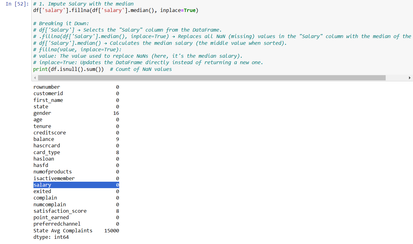
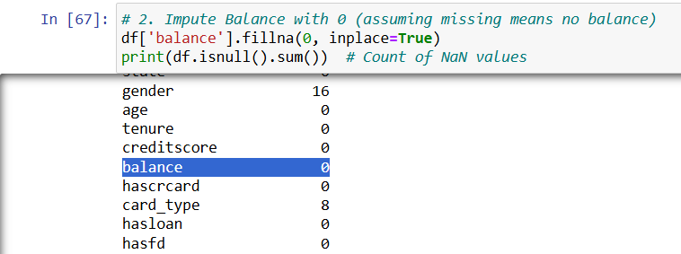
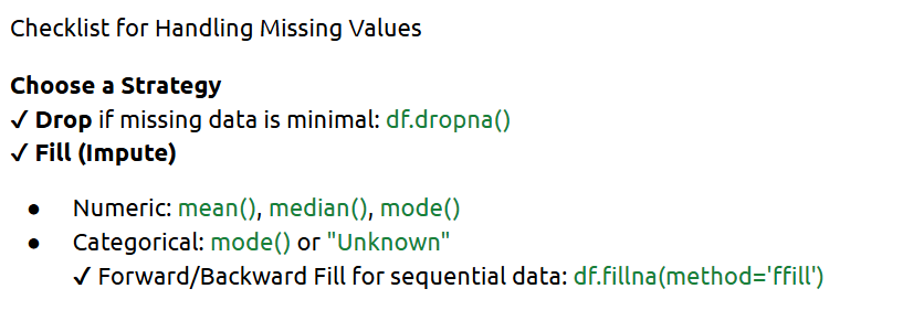
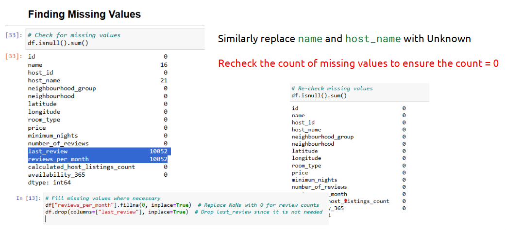
- Filling Missing Values
Missing data can lead to skewed analysis — handling it is critical.
What is it?
Filling gaps in the dataset using strategies like mean, median, or domain-specific logic.
Where is it used?
Before modeling or dashboarding — required for clean results.
How is it used?
• Use .isnull().sum() to count nulls
• Use .fillna() for imputation
• Choose method: mean (for continuous), mode (for categorical), forward fill (for time series)
- Handling Outliers
Outliers can distort trends and reduce model accuracy — you must spot and treat them.
What is it?
Values that fall far outside the normal range of the dataset.
Example:
# IQR method
--- Takeaways / best practices
• Outliers aren’t always bad — they may be valid extreme cases
• Visualize before deciding to drop or cap
• Use business context to guide treatment
- Working around Problem statements
Solving a problem is more than just analyzing data — it’s about turning findings into actionable outcomes.
What is it?
Applying analytical methods to answer specific business questions defined at the start.
Where is it used?
In final stages of analytics — drawing conclusions or building models to meet goals.
How is it used?
• Use findings from EDA and feature engineering
• Create hypothesis (e.g., high transaction customers churn less)
• Support your insights with visuals, stats, or models
• Recommend actionable next steps
Example:
If churn is highest among customers with low balance and no product upgrades — suggest targeting them with promotions.
--- Takeaways / best practices
• Tie your insights back to business impact
• Don’t just answer what — explain why
• Structure your solution so it’s usable (in reports, models, or dashboards)
Topic 9: AI in Data Analytics & Review Analysis
- Data Analytics in Python using AI
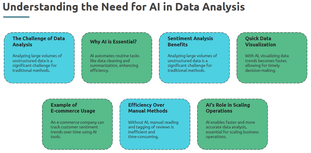
We’re entering the era where AI enhances how we analyze data — automating insights, surfacing trends, and making predictions.
What is it?
Leveraging AI techniques (like NLP or ML) within Python to extract deeper, faster insights from data.
Where is it used?
In product analytics, customer service automation, recommendation systems, fraud detection, and more.
How is it used?
• Use AI libraries (e.g., scikit-learn, spaCy, transformers) to process and model data
• Automate feature extraction using ML
• Apply pre-trained models to categorize or summarize textual feedback
• Use AI to scale decision-making based on complex data
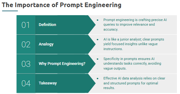
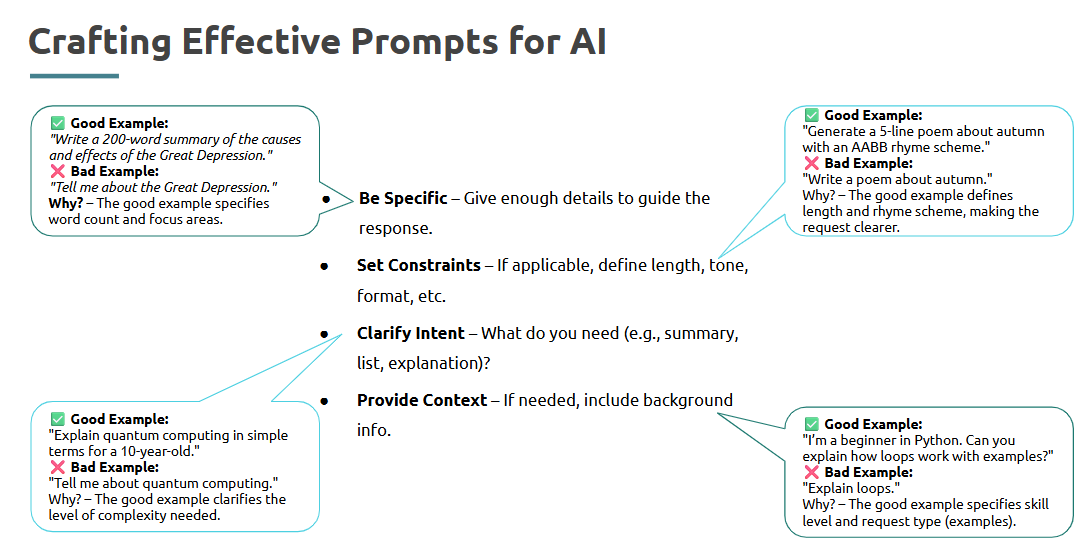
- Prompt Engineering
Prompt engineering is the art of asking AI models the right questions — it’s key to getting accurate, helpful outputs.
What is it?
Structuring your input (prompts) to AI tools like ChatGPT or LLMs for better results.
Where is it used?
Used in data cleaning, report generation, code writing, and summarizing customer feedback via AI.
How is it used?
• Start with clear, specific instructions
• Use examples in prompts when needed
• Break down large problems into smaller steps
• Refine outputs using follow-up prompts
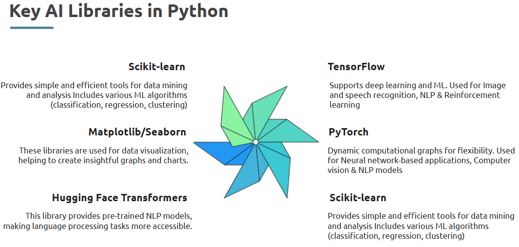
- AI Libraries in Python
Python has a robust ecosystem for AI — from classic ML to state-of-the-art deep learning and NLP.
What is it?
Libraries that offer AI and ML capabilities: modeling, text processing, prediction, classification, etc.
Where is it used?
Across data science tasks like classification, regression, clustering, sentiment analysis, and more.
Interview Preparation
Was this article helpful?
That’s Great!
Thank you for your feedback
Sorry! We couldn't be helpful
Thank you for your feedback
Feedback sent
We appreciate your effort and will try to fix the article