TABLE OF CONTENTS
- DA-104
- Topic 1: Introduction to DA-104 and Power BI Ecosystem
- Topic 2: Data Sources and Workflow Setup in Power BI
- Topic 3: Data Transformation, Modeling & DAX Essentials
- - Data Transformation in Power Query
- - Calculations and Enhancements
- - Combining and Managing Queries
- - Parameterization and Final Touches
- Step 3 - Data Modeling
- - Recap of SQL ER Diagram
- - Relationships in Power BI
- - Cardinality and cross-filter direction
- - Active & Inactive Relationships
- - Star Schema
- - Introduction to DAX
- - Creating calculated columns and measures
- - Basic DAX functions: SUM, COUNT, AVERAGE, etc.
- Topic 4: Advanced DAX, Basic Visuals & Effective Reporting
- Topic 5: Dashboard Use Case and Power BI Practice
- Topic 6: Interactivity and Deployment with Power BI
- Topic 7: Complex Visuals and KPI Reporting
- Topic 8: Introduction to Tableau & Basic Visuals
- Topic 9: Tableau Prep, Calculations & Aggregations
- Topic 10: Advanced Tableau Visualizations & Interactivity
- -Interview Resources
- Top 40+ Power BI Interview Questions And Answers : Link
- Power BI Interview Questions for Freshers & Beyond : Link
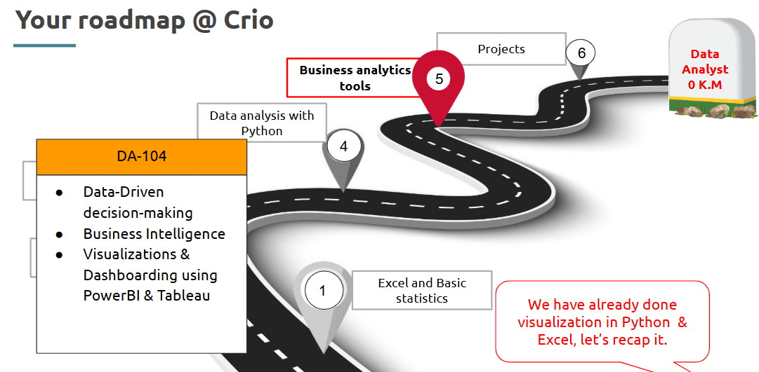
DA-104
Sprint summary
Getting Started
Topic 1: Introduction to DA-104 and Power BI Ecosystem
- Introduction to DA-104
This sprint introduces Business Intelligence and Power BI, helping you learn how to visualize and present data meaningfully.
What is it?
DA-104 is a data analytics sprint that focuses on business intelligence and hands-on visual storytelling using Power BI.
Where is it used?
Commonly in corporate dashboards, reporting systems, and performance tracking for departments like sales, marketing, finance, and operations.
How is it used?
• Learn to connect datasets from Excel, databases, and web APIs
• Transform and clean data in Power BI
• Build reports using graphs, tables, and slicers
• Share dashboards through Power BI Service
--- Takeaways / best practices
• Start with clear business questions before visualizing
• Focus on clean, structured data
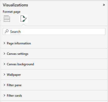
• Get familiar with Power BI interface and its key panes (Fields, Visualizations, Filters)
- Recap on Data visualization?
Data visualization is the art of turning raw data into intuitive visuals to spot patterns, trends, and insights quickly.
What is it?
A graphical representation of information that makes complex data easier to interpret.
Where is it used?
In presentations, dashboards, reports, and any data-driven decision-making processes.
How is it used?
• Choose the right chart type based on data (e.g., bar for comparison, line for trends)
• Map data fields to visual elements (e.g., X-axis, Y-axis, color, size)
• Use filters and labels to make visuals interactive and readable
--- Takeaways / best practices
• Keep visuals simple and focused
• Avoid clutter — less is more
• Use color meaningfully (e.g., red for loss, green for gain)
- Why is it important?
Without visualization, data often remains buried in spreadsheets. Good visuals reveal the story behind numbers.
What is it?
It's important because it bridges the gap between data and decision-making by enabling quicker comprehension.
Where is it used?
Business meetings, dashboards, monthly performance reviews, public reports, and news data visualizations.
How is it used?
• Highlight KPIs to track business performance
• Compare historical trends
• Communicate data insights to non-technical stakeholders
--- Takeaways / best practices
• Good visuals accelerate understanding and reduce misinterpretation
• Stakeholder engagement increases when visuals are interactive and insightful
- How does data visualization work?
It works by mapping numeric or categorical data to visual elements such as position, size, shape, and color.
What is it?
A method of encoding data visually to reveal trends, patterns, and outliers.
Where is it used?
BI tools (like Power BI, Tableau), Excel, Python (matplotlib, seaborn), and dashboards.
How is it used?
• Choose a visualization tool (e.g., Power BI)
• Drag fields into the canvas to create visuals (charts, maps, etc.)
• Add filters or slicers for interaction
Example:
--- Takeaways / best practices
• Different chart types are best for different data stories
• Always test visuals for clarity — if it’s hard to read, it’s not effective
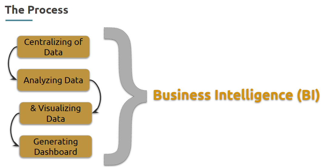
- Understanding Business Intelligence
Business Intelligence (BI) is about converting raw data into actionable insights using tools like Power BI.
What is it?
BI is a process and set of tools used to collect, transform, and present data for business decision-making.
Where is it used?
Across industries for sales tracking, customer analysis, risk management, and financial planning.
How is it used?
• Gather data from multiple sources
• Clean and model the data
• Create dashboards with KPIs, charts, and trends
• Share reports with decision-makers
--- Takeaways / best practices
• BI is not just technical — it’s about solving business problems with data
• Clear data models improve the quality of BI reports
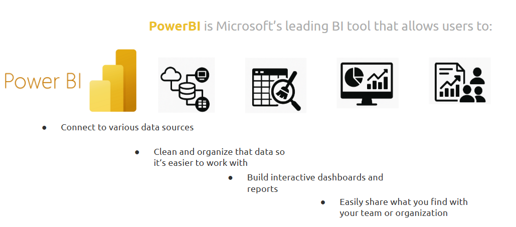
- The Role of Power BI
Power BI helps you analyze, visualize, and share your data — all within one platform.
What is it?
A Microsoft BI tool for data visualization, transformation, and reporting.
Where is it used?
In organizations for dashboards, automated reporting, and analytics collaboration.
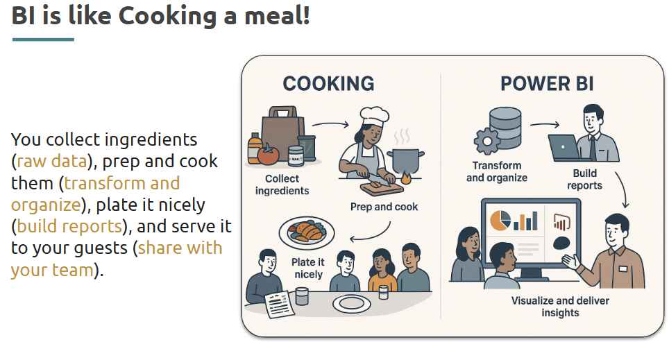
How is it used?
• Import data from Excel, SQL, APIs
• Clean it using Power Query
• Model it using relationships and calculated fields
• Visualize it with charts, tables, slicers
• Publish it to the Power BI Service for sharing
--- Takeaways / best practices
• Power BI integrates well with Microsoft products
• Understand DAX and relationships for advanced usage
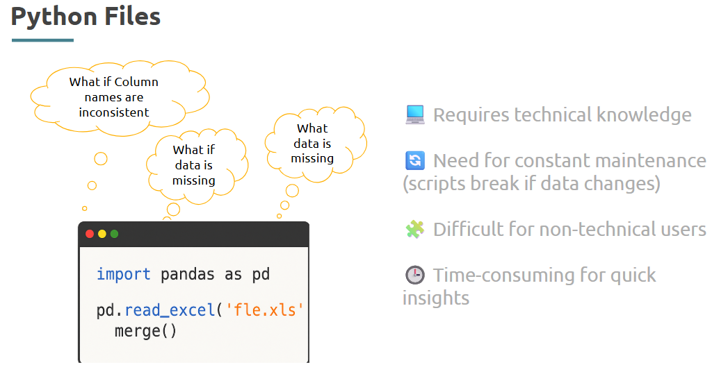
- How it differs from Excel and Python
Each tool has its strengths. Power BI is optimized for dashboards, Excel for flexibility, and Python for automation and scale.
What is it?
Power BI provides a low-code interface for creating interactive dashboards, unlike Excel formulas or Python scripts.
Lets discuss a Scenario:
Where is it used?
Power BI is preferred in enterprise environments for sharing, while Excel is often used for quick analysis, and Python for automation or ML.
How is it used?
• Power BI: drag-drop visuals, share online
• Excel: formulas, pivot tables
• Python: scripting, data pipelines
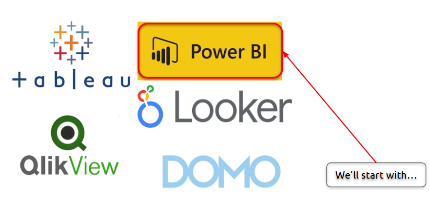
Business Intelligence Tools:
--- Takeaways / best practices
• Use Power BI for presentation-ready dashboards
• Use Python when custom logic or automation is needed
• Excel works best for quick manual exploration
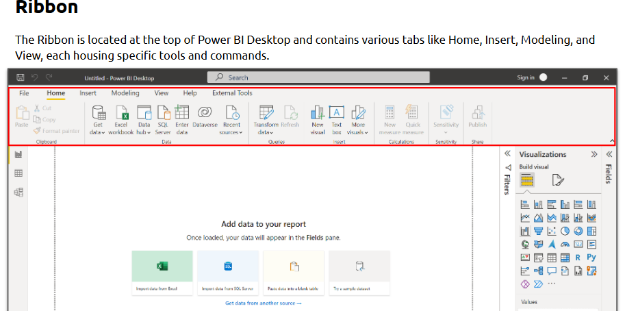
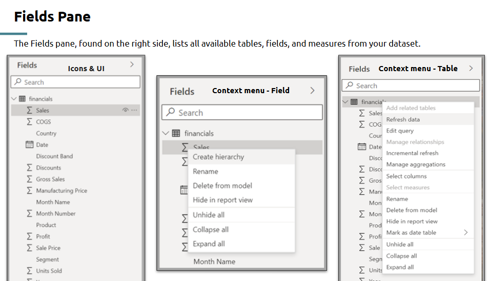
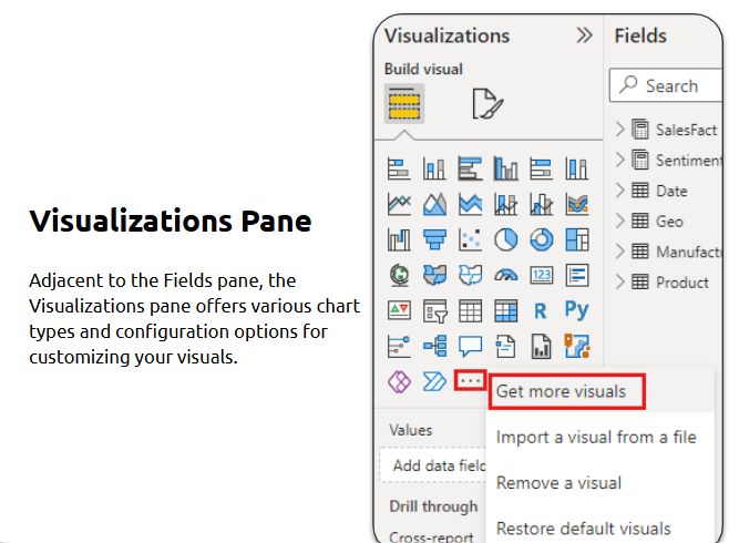
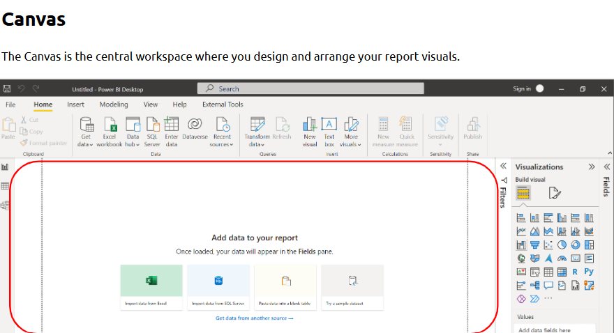
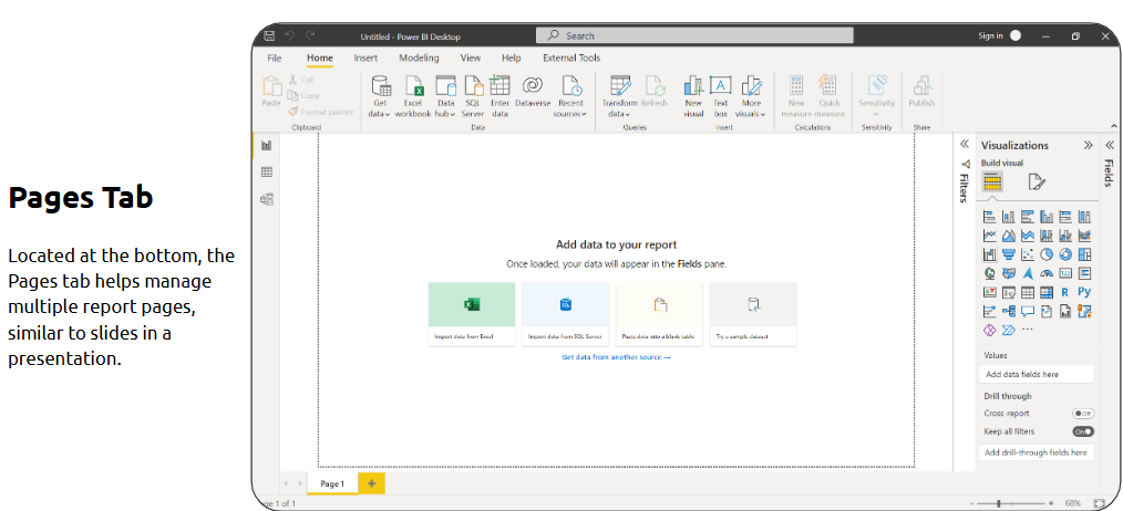
- Introduction to Power BI Ecosystem
The Power BI ecosystem includes multiple components for end-to-end BI — from ingestion to sharing insights.
What is it?
A suite of tools: Power BI Desktop, Power BI Service, Power BI Mobile, and Power BI Gateway.
How is it used?
Let’s look at certain sections of PowerBI before we jump directly into it:
Where is it used?
Enterprises, startups, and data teams managing end-to-end reporting solutions.
--- Takeaways / best practices
• Know the full lifecycle — design → publish → share
• Use gateways for live connections to enterprise data
• Understand licensing if deploying in large teams
Topic 2: Data Sources and Workflow Setup in Power BI
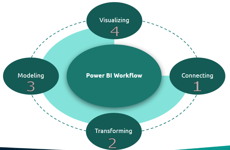
- Understanding the Power BI workflow
Power BI workflow refers to the end-to-end process of loading, transforming, analyzing, and publishing data through Power BI’s suite.
What is it?
A sequence of steps in Power BI starting from connecting data to sharing insights.
Steps of PowerBI workflow:
Where is it used?
Used by data analysts and BI developers to streamline reporting processes.
How is it used?
• Load data into Power BI Desktop
• Clean and shape it using Power Query
• Create relationships and data models
• Build visuals and reports
• Publish to Power BI Service or embed in apps
--- Takeaways / best practices
• Follow a logical data flow: source > transform > model > visualize > share
• Always test visualizations with filtered views to ensure accuracy
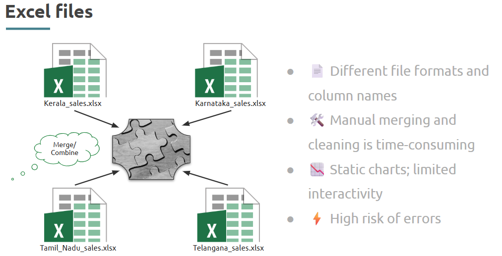
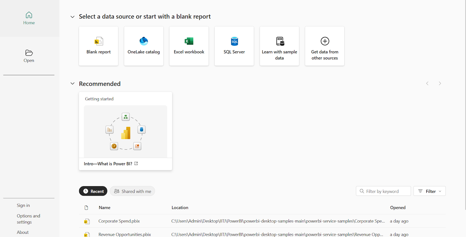
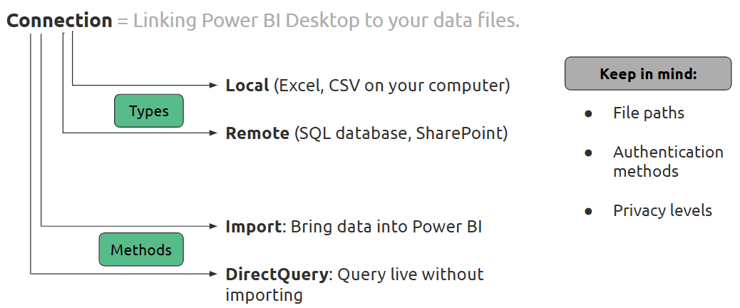
Step 1- Connecting to various data sources: Excel, CSV, databases
Power BI supports importing data from a variety of sources like Excel, CSV, databases, and online services.
What is it?
Connecting to data is the first step in report development, allowing integration of internal or external datasets.
Where is it used?
Power BI Desktop and Power Query interface
Difference between Connection Types:

How is it used?
• Click on “Get Data” in Power BI
• Choose source (e.g., Excel, CSV, SQL Server, Web API)
• Navigate and select the file or database
• Preview and load into Power BI
--- Takeaways / best practices
• Know your data source limitations (e.g., max file size)
• Use naming conventions while importing to stay organized
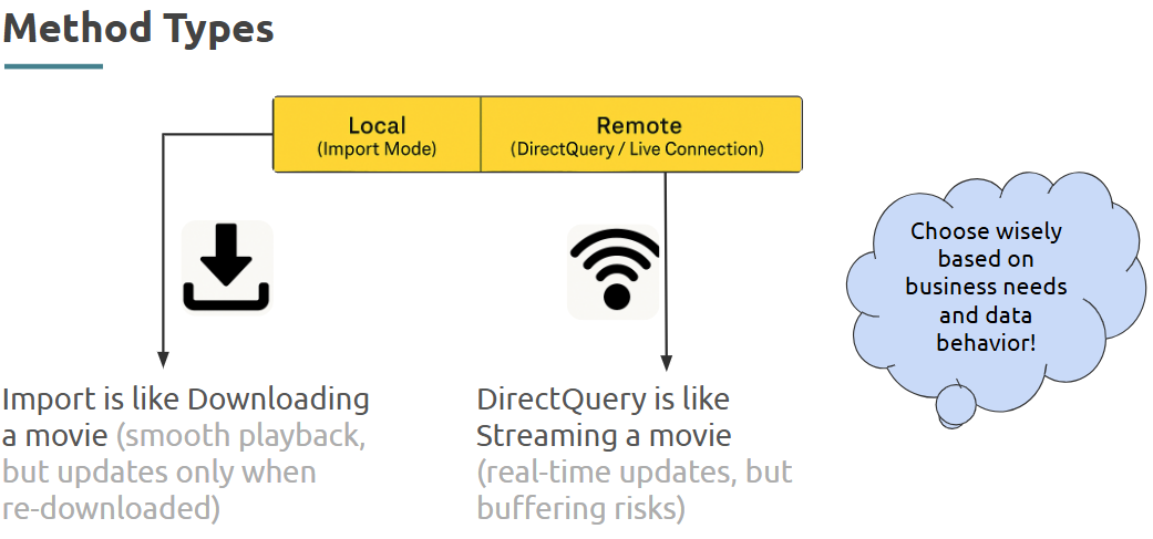
- Understanding Data Import vs. DirectQuery mode
Import mode and DirectQuery define how data is accessed in Power BI.
What is it?
Import stores data in Power BI; DirectQuery queries the source live.
Where is it used?
Used during the “Get Data” step and affects performance.
How is it used?
• Select mode after choosing a data source
• Import: faster visuals, offline analysis
• DirectQuery: real-time updates but slower
Try these connections:
--- Takeaways / best practices
• Use Import for performance and static data
• Use DirectQuery for up-to-date dashboards connected to live systems
- Overview of common data types in Power BI
Power BI supports several data types like Text, Number, Date/Time, Boolean, and Currency.
What is it?
Understanding types is key to accurate filtering, aggregations, and visualizations.
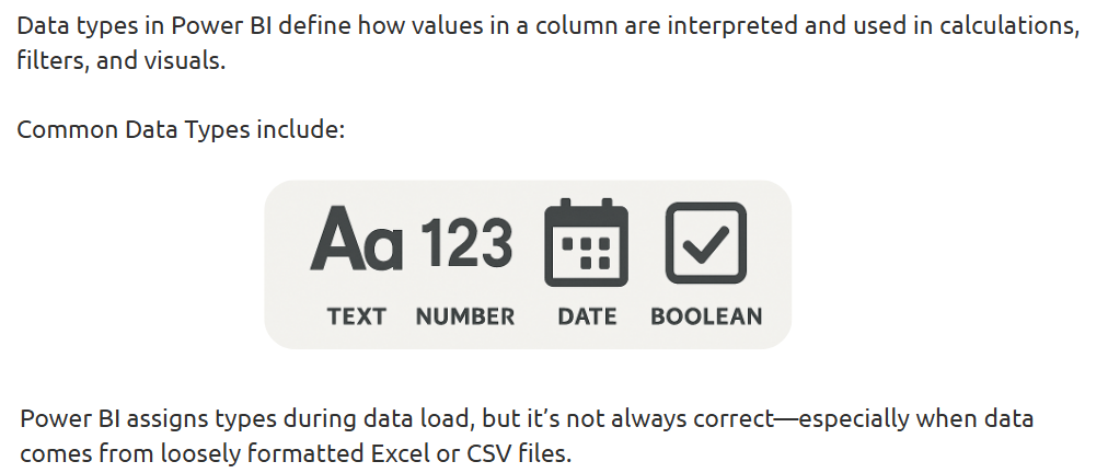
Where is it used?
In Power Query Editor and Data View pane
How is it used?
• Auto-detected or manually set in Power Query
• Use “Data Type” dropdown to fix types
• Ensures proper sorting and summarization
--- Takeaways / best practices
• Always confirm data types after import
• Incorrect types can break DAX formulas and visuals
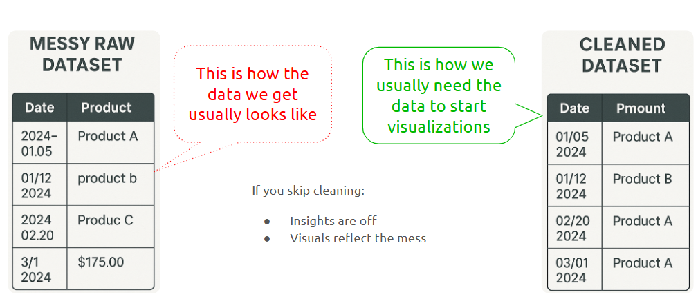
Step 2- Data Transformation in Power Query
Power Query is the data cleaning engine in Power BI.
What is it?
A visual editor that lets you clean and shape data before analysis.
Why Data Transformation matters:
Where is it used?
Launched from Power BI via “Transform Data”
How is it used?
• Open Power Query Editor
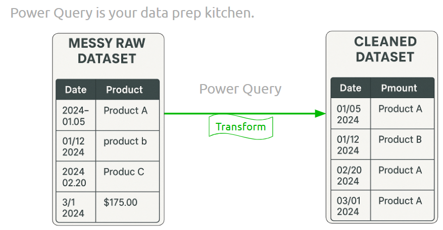
• Remove rows, rename columns
• Split/merge columns, fill blanks
• Apply steps shown in the Applied Steps pane
- Basic Setup and Cleaning
Before building visuals, ensure data is properly structured and cleaned.
What is it?
Where is it used?
Performed in Power Query and Data View
How is it used?
• Remove unnecessary columns
• Rename and reorder columns
• Set correct data types
--- Takeaways / best practices
• Make sure each column has a single data type
• Use clear and descriptive field names
- Structural Adjustments
Structural adjustments make data more analysis-friendly.
What is it?
Where is it used?
In Power Query Editor
How is it used?
• Use “Unpivot Columns” to normalize wide tables
• Rename new fields logically
• Merge related tables when needed
--- Takeaways / best practices
• Normalize your data to fit star schema logic
• Structural consistency simplifies DAX and modeling
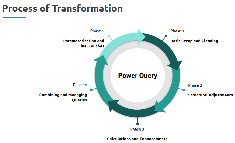
Topic 3: Data Transformation, Modeling & DAX Essentials
- Data Transformation in Power Query
What is it?
Data Transformation in Power Query involves shaping and cleaning the data before loading it into Power BI for analysis.
Where is it used?
It is used in the Power BI Query Editor to prepare raw datasets for reporting and modeling by removing errors, changing formats, and structuring data appropriately.
How is it used?
--- Takeaways / Best Practices
Keep transformation steps meaningful and minimal. Preview and profile data before making changes. Always structure the data in a tabular format for compatibility with Power BI visuals.
- Calculations and Enhancements
What is it?
Enhancing your dataset using custom calculations such as new columns, measures, or logic that enrich your analysis.
Where is it used?
Used in Power Query for row-level transformations and in Power BI via DAX for dynamic measures and KPIs.
How is it used?
--- Takeaways / Best Practices
Use calculated columns for static row-wise values and DAX measures for dynamic aggregations. Name fields clearly to improve readability.
- Combining and Managing Queries
What is it?
This refers to merging or appending queries to create a unified view of data from multiple tables or sources.
Where is it used?
Inside Power Query Editor, especially in ETL (Extract, Transform, Load) processes.
How is it used?
--- Takeaways / Best Practices
Always match the schema when appending queries. When merging, ensure join keys are clean and unique.
- Parameterization and Final Touches
What is it?
This means making queries dynamic by introducing user-defined variables.
Where is it used?
Often used in advanced data models where flexible inputs are required.
How is it used?
--- Takeaways / best practices
Parameterization enables reuse and flexibility. Use it for paths, thresholds, or switchable filters.
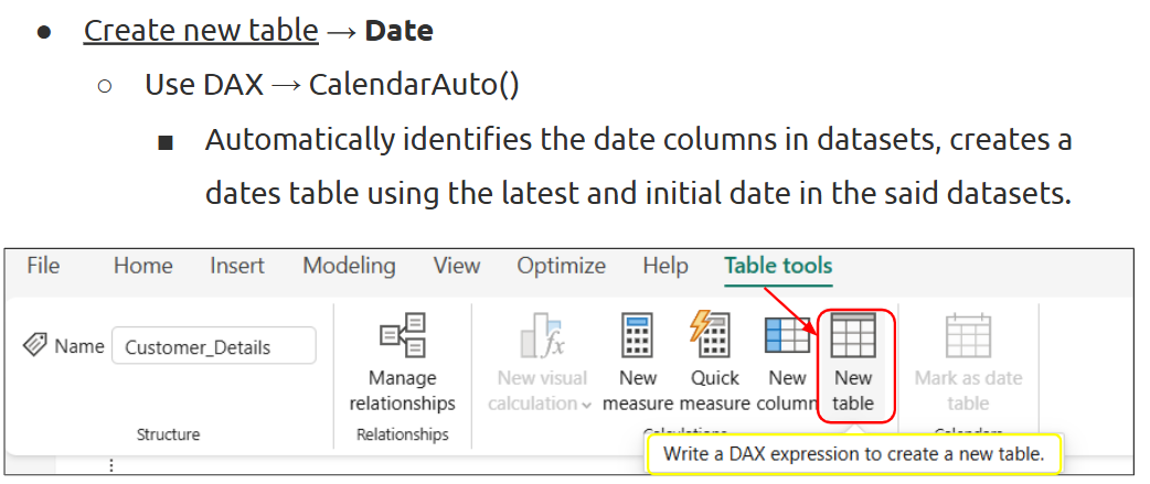
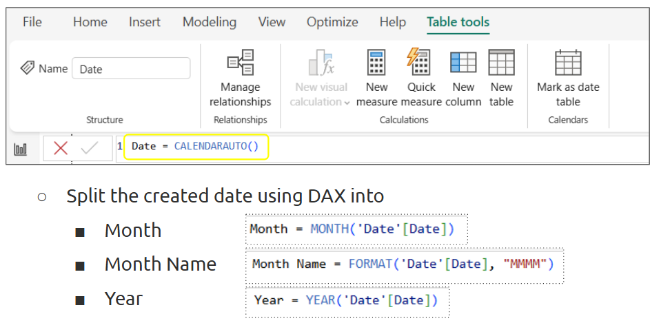
Step 3 - Data Modeling
What is it?
Where is it used?
In Power BI’s Model view to define how tables interact.
How is it used?
--- Takeaways / best practices
Use star schema wherever possible for clarity and performance. Avoid many-to-many relationships unless necessary.
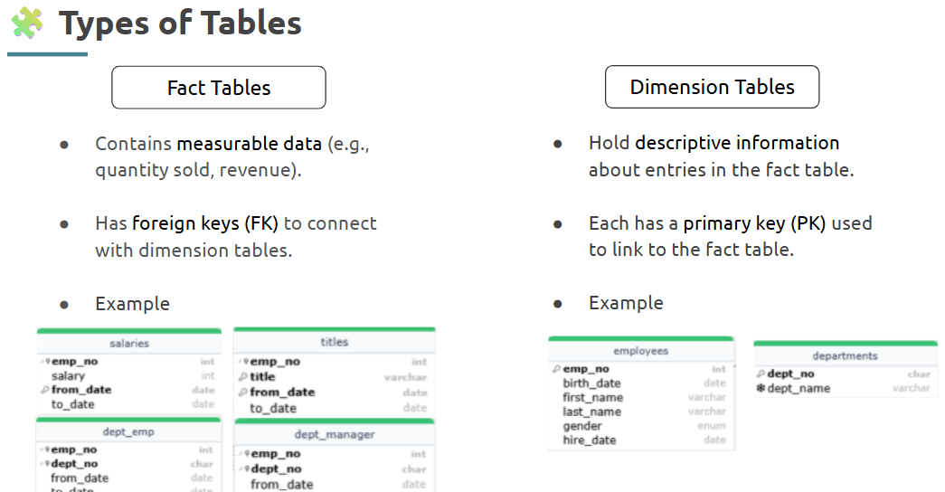
- Recap of SQL ER Diagram
What is it?
An Entity-Relationship (ER) diagram shows how entities (tables) relate in a database.
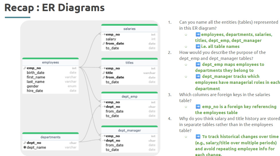
Where is it used?
Used during database design or Power BI modeling to visualize structure.
--- Takeaways / best practices
Understand ER diagrams to simplify building relationships and define keys in Power BI.
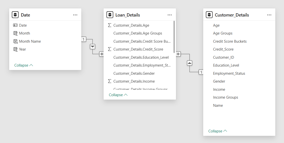
- Relationships in Power BI
What is it?
These define how data flows between tables through keys.
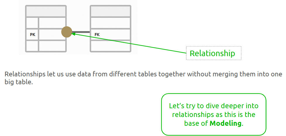
Where is it used?
In the Model view of Power BI to link fact and dimension tables.
--- Takeaways / best practices
Use single-direction filters unless needed.
Always validate joins using sample visuals.
- Cardinality and cross-filter direction
What is it?
Cardinality defines how many records relate across tables; cross-filter direction determines filter flow.
Where is it used?
Important in Power BI model view while setting relationships.
How is it used?
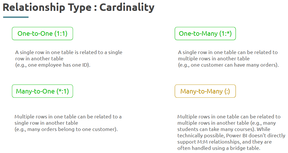
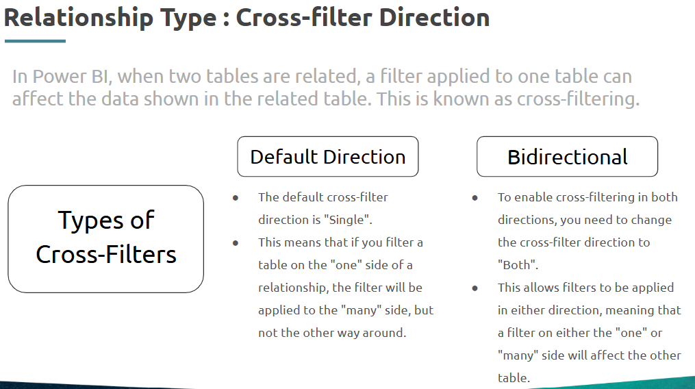
--- Takeaways / best practices
Use single filter direction by default. Understand the data structure to avoid circular dependencies.
- Active & Inactive Relationships
What is it?
Active relationships are used by default; inactive ones are available for alternate paths.
Where is it used?
Used in complex models with multiple date columns or custom paths.
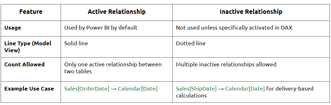
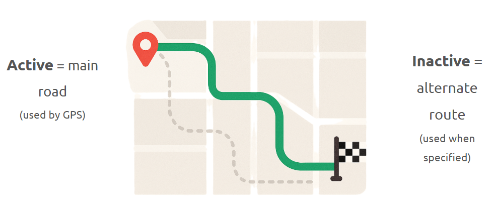
--- Takeaways / best practices
Keep only one active path per context.
Use inactive relationships for flexibility in time intelligence.
- Star Schema
What is it?
A schema with one central fact table connected to multiple dimension tables.
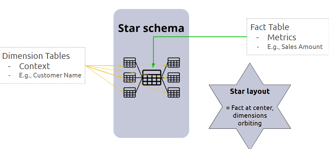
Where is it used?
Common in BI modeling and ideal for Power BI.
How is it used?
--- Takeaways / best practices
Star schema improves performance and simplifies DAX. Avoid snowflake designs unless necessary.
- Introduction to DAX
What is it?
DAX (Data Analysis Expressions) is a formula language used in Power BI to perform calculations.
Where is it used?
In calculated columns, measures, and tables in Power BI reports.
What can DAX do?
Core DAX Functions:

--- Takeaways / best practices
Understand row vs. filter context.
Use measures for aggregations and columns for row-level logic.
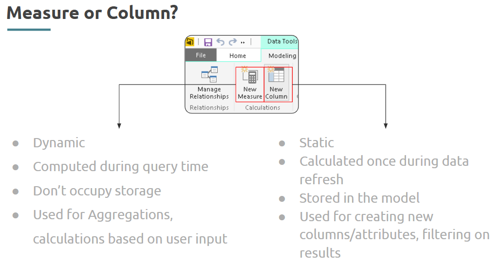
- Creating calculated columns and measures
What is it?
Calculated columns are row-level formulas; measures are dynamic, context-sensitive aggregations.
Where is it used?
Used in Power BI Data view to enrich models.
How is it used?
--- Takeaways / best practices
Prefer measures for flexibility and performance.
Name measures with clear business meaning.
- Basic DAX functions: SUM, COUNT, AVERAGE, etc.
What is it?
These are foundational aggregation functions in DAX.
Where is it used?
Used in measures and calculated columns.
How is it used?
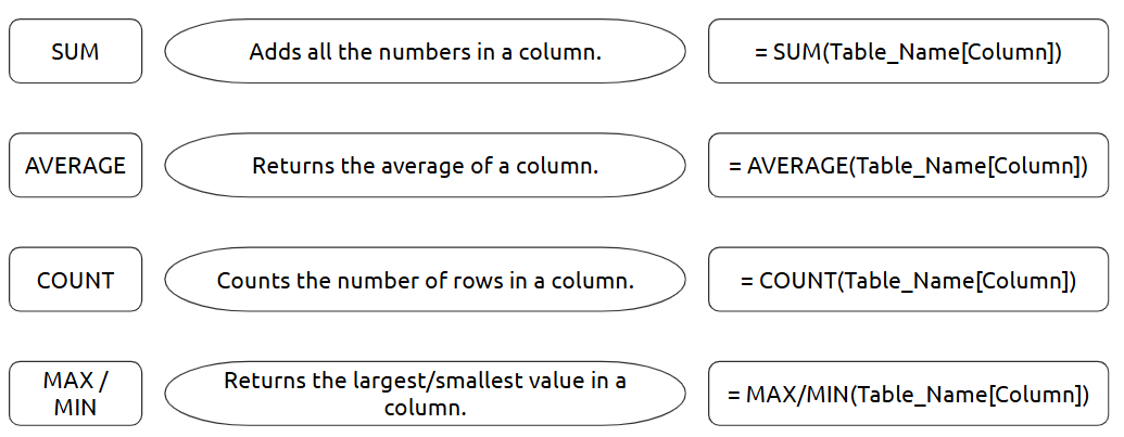
--- Takeaways / best practices
Start with core functions and layer in complexity gradually.
Test results using sample visuals.
Topic 4: Advanced DAX, Basic Visuals & Effective Reporting
- Using CALCULATE for complex calculations
CALCULATE and ALL are powerful DAX functions that allow conditional filtering and context modification to produce more dynamic metrics.
What is it?
CALCULATE modifies the filter context of a calculation. ALL removes filters from specific columns/tables in a calculation.
Where is it used?
Used in Power BI DAX expressions to build complex KPIs, dynamic filtering, and measure-level calculations.
How is it used?
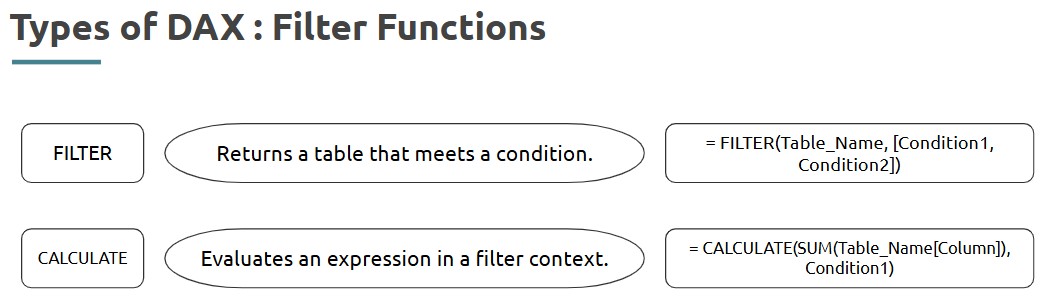
--- Takeaways / best practices
• Use CALCULATE when you need custom context
• Useful in dashboards to ensure consistency in KPIs
- Other important DAX functions
DAX includes many essential functions for text handling, date calculations, and logical conditions.
What is it?
These are functions like IF, SWITCH, TODAY , CONCATENATE functions etc that simplify data modeling.
Where is it used?
Used in calculated columns, measures, and dashboards to enhance data logic and formatting.
How is it used?
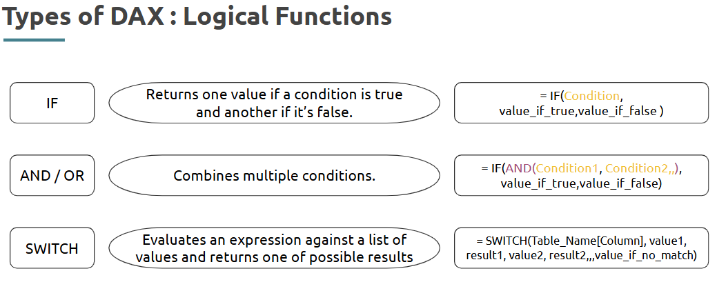
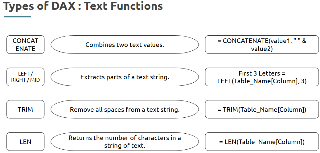
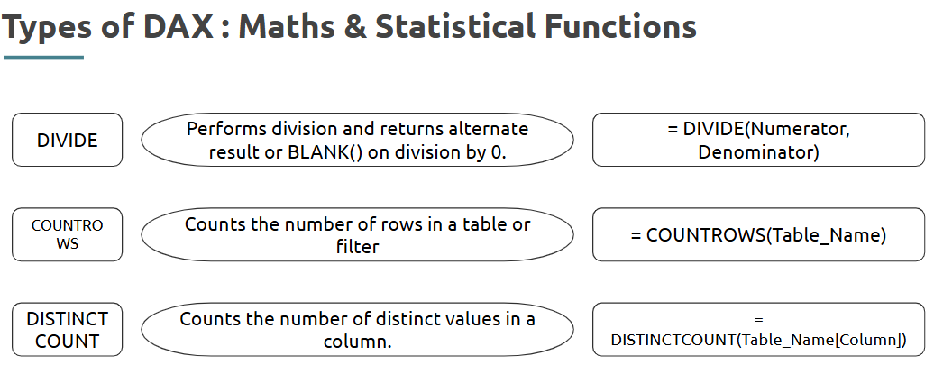
--- Takeaways / best practices
• Choose SWITCH over nested IFs for readability
• Use DIVIDE to avoid divide-by-zero errors
• Always validate logic with sample visuals
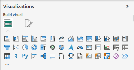
Step 4 - Creating Basic Visualizations
Visuals convert raw data into understandable insights in Power BI.
What is it?
The visual layer of Power BI where charts and graphics display your summarized data.
Why Visualize Data Effectively?
Where is it used?
Used in Power BI reports and dashboards to present analysis effectively.
How is it used?
--- Takeaways / best practices
• Always use clean and clear labels
• Match visual types with the right data (categorical vs. continuous)
• Avoid clutter—each visual should have one focus
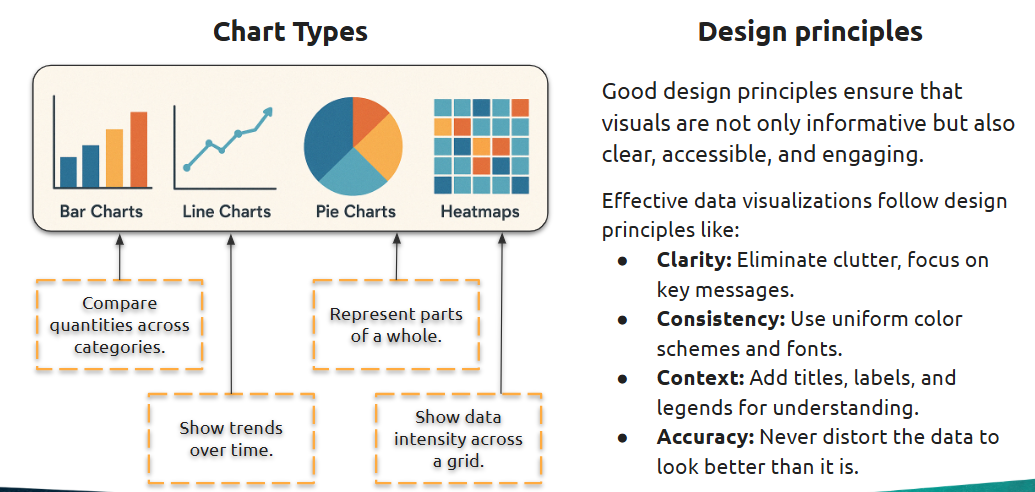
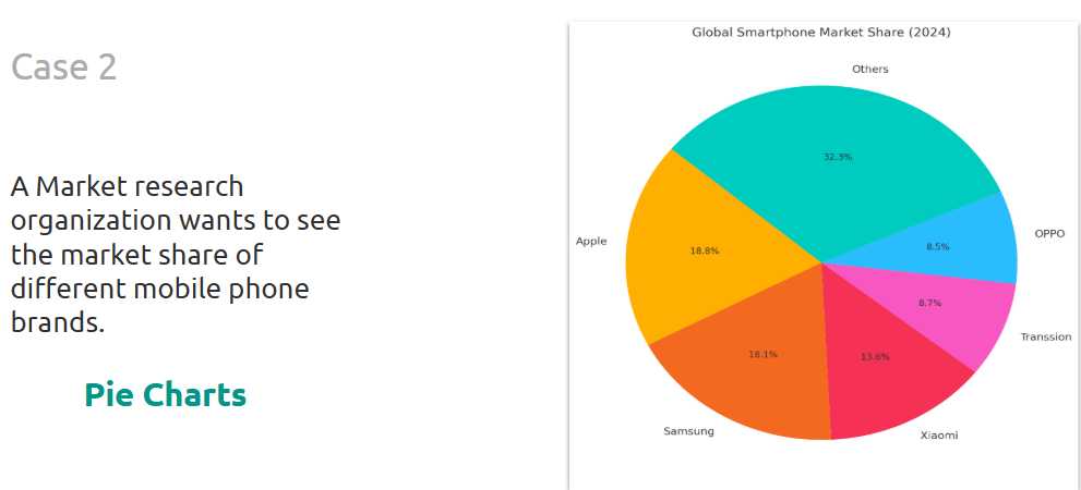
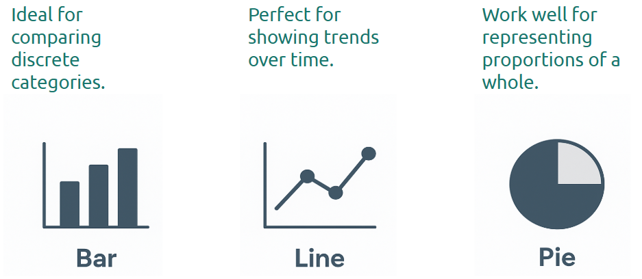
- Bar charts, line charts, and pie charts
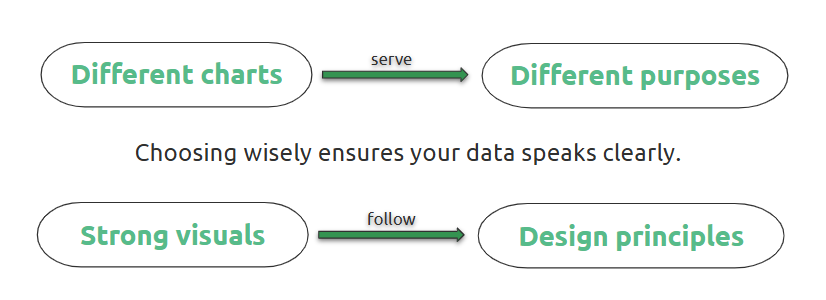
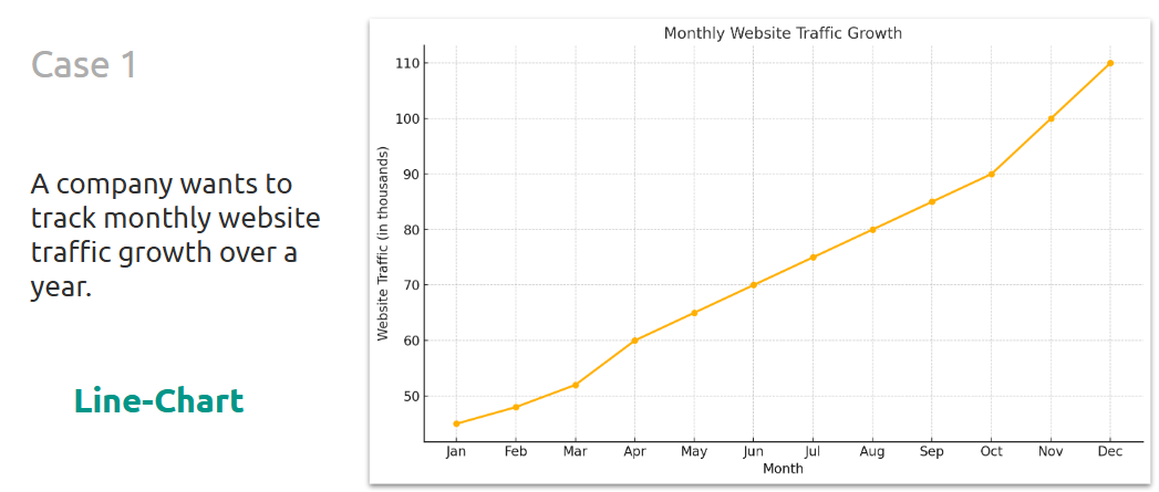
These basic chart types help communicate trends, comparisons, and proportions.
What is it?
Bar charts compare categories, line charts show trends over time, and pie charts display part-to-whole relationships.
Where is it used?
These are core visuals in BI reports, especially for KPIs, trends, and summary dashboards.
How is it used?
--- Takeaways / best practices
• Avoid using pie charts with too many slices
• Line charts should have continuous x-axes (like dates)
• Use color sparingly to emphasize key insights
- Tables and matrices for reporting
Used for detailed, grid-based data reporting within dashboards.
What is it?
Tables show flat data; matrices allow hierarchical drill-downs (like pivot tables).
Where is it used?
Used when raw numbers, breakdowns, or comparisons are required in a visual format.
How is it used?
--- Takeaways / best practices
• Use matrices to simulate Excel-style reports
• Collapse/expand hierarchy in matrices for better storytelling
• Format numbers consistently (e.g., currency, percentage)
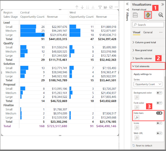
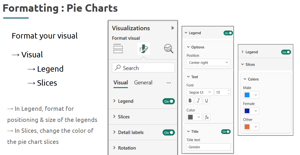
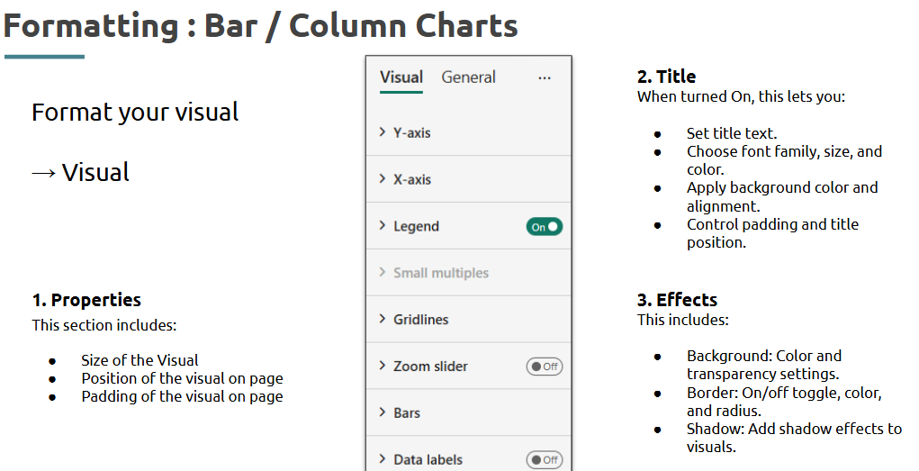
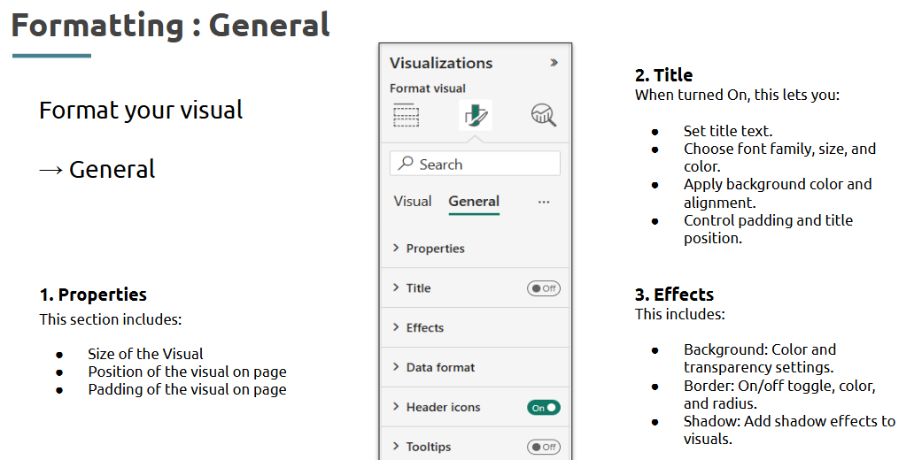
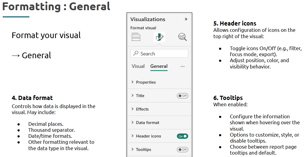
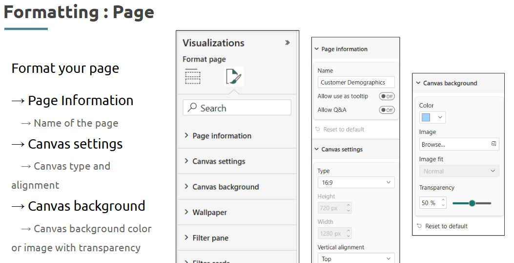
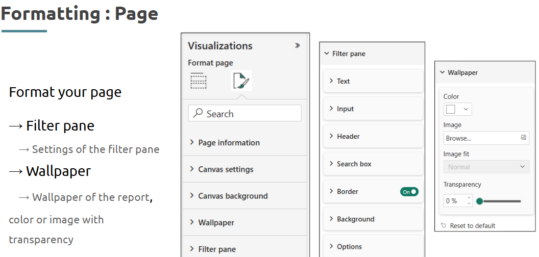
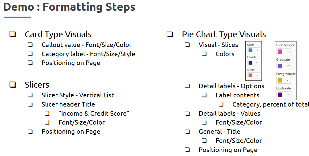
- Customizing visuals: Formatting, legends, and labels
Polishing visuals makes data easier to understand and visually appealing.
What is it?
Visual customization includes formatting axes, setting legends, adding data labels, and choosing colors.
Where is it used?
Used in all types of Power BI visuals to match branding or emphasize insights.
How is it used?
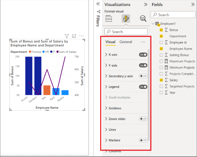
--- Takeaways / best practices
• Keep formatting consistent across visuals
• Don’t overload visuals with too much detail
• Use neutral themes unless colors are meaningful
- Creating Impact through Visuals
Impactful visuals don’t just look good—they drive decisions.
What is it?
The practice of designing visuals that clearly communicate insights with minimal cognitive load.
Where is it used?
Used in executive dashboards, reports for stakeholders, and data storytelling.
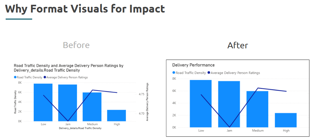
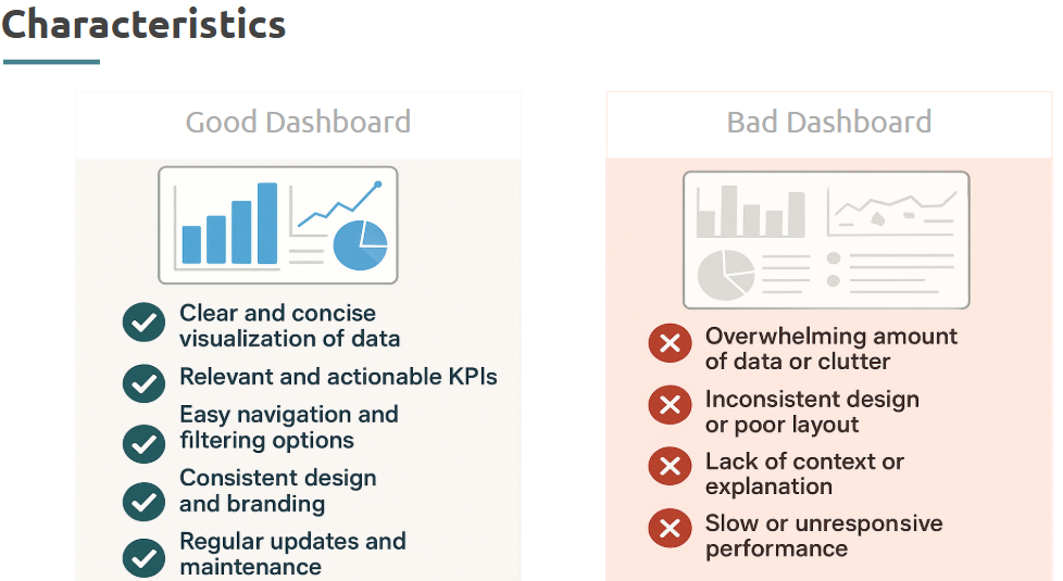
Good Dashboard Examples:
--- Takeaways / best practices
• Tell a story with your visuals, not just data
• Think from the viewer’s perspective
• Use annotations and tooltips for clarity
Topic 5: Dashboard Use Case and Power BI Practice
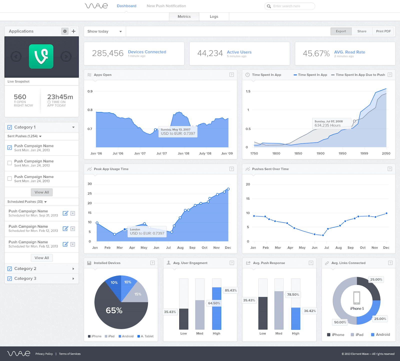
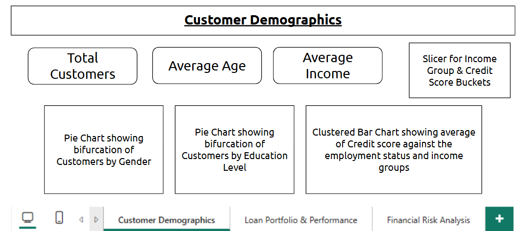
- Creating PowerBI Dashboards
What is it?
Dashboards in Power BI are single-page, interactive collections of visuals that summarize key metrics and insights.
Where is it used?
Used across industries for executive reporting, operational monitoring, and real-time analytics by displaying KPIs, charts, and metrics in one view.
How is it used?
• Pin visuals from reports to a dashboard
• Arrange and resize tiles to prioritize insights
• Add dynamic visuals like KPIs, cards, and slicers
• Connect to real-time data or scheduled refreshes
• Share dashboards via Power BI service
Example:
--- Takeaways / best practices
• Keep it simple and goal-focused—only the most important metrics
• Use consistent colors and labels
• Always test interactivity (filters, slicers) before sharing
• Combine data sources smartly to tell a holistic story
- Understanding practice use case
What is it?
Practice use cases are mock or real-world scenarios that help simulate how Power BI is used to solve business problems.
Where is it used?
Used in learning environments, internal demos, or client projects to practice EDA, modeling, and reporting end-to-end.
How is it used?
• Define the business goal (e.g., reduce churn, track revenue)
• Identify relevant datasets
• Perform cleaning, transformation, and modeling
• Build visuals and dashboards tailored to solving the case
• Communicate the final output with actionable insights
--- Takeaways / best practices
• Start with the business question—not the data
• Make assumptions clear if working with incomplete datasets
• Treat it like a real project: plan, design, and iterate
• Document your thought process alongside visuals
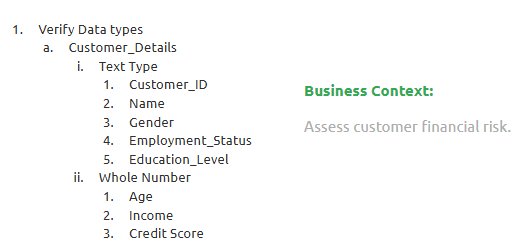
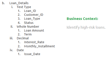
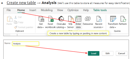
- Data Cleaning, Transformation & Modeling
What is it?
This is the end-to-end process of preparing raw data into a clean, structured format and building relationships for effective reporting.
Where is it used?
It’s the backbone of every Power BI project—applied before and during visual building to ensure accurate insights.
How is it used?
• Clean column names and remove unnecessary data in Power Query
• Handle missing values (replace, remove, fill)
• Apply data types, format, and structure (e.g., dates, numbers)
• Create relationships in the data model view
• Build calculated columns and measures with DAX
Example(Creating PowerBI Dashboards):
Financial Risk Analysis Dashboard:
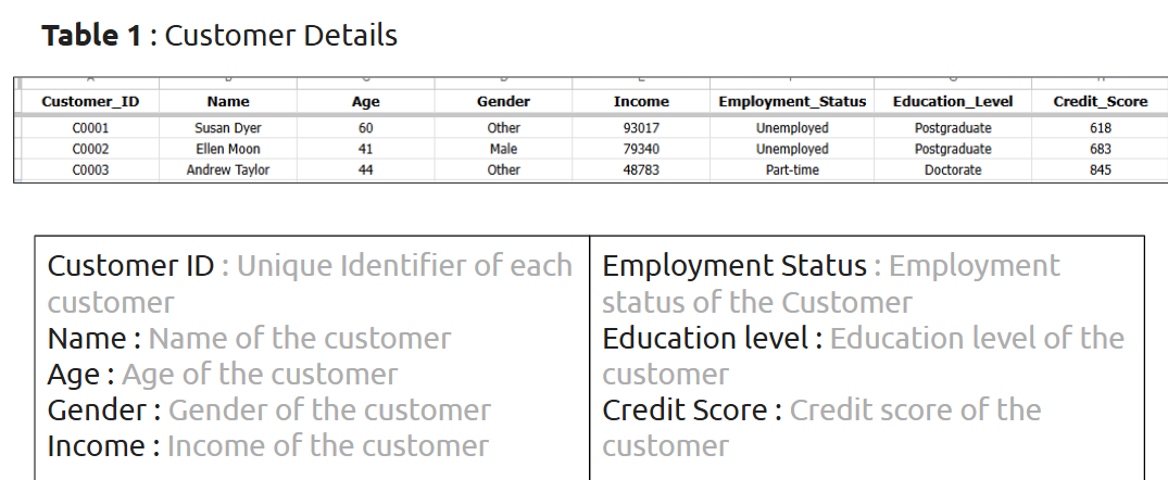
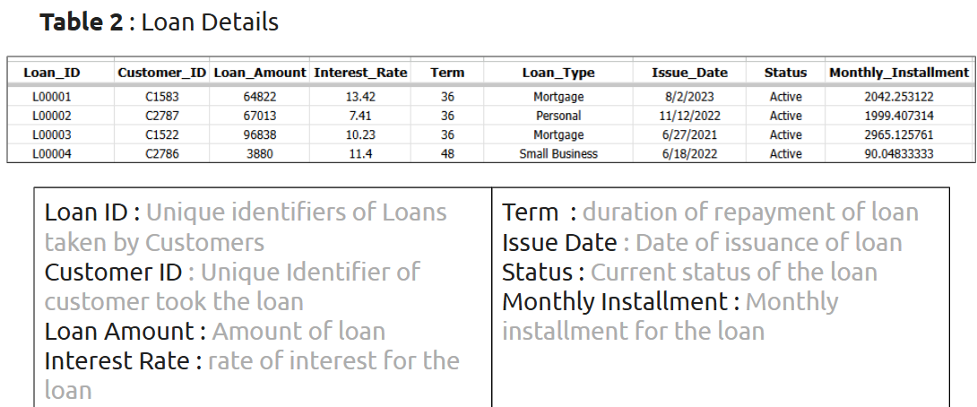
DataSet Overview:
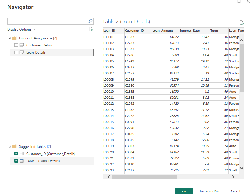
Step 1- Data Loading:
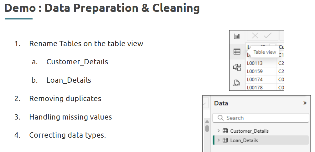
Data Preparation and Data Cleaning:
Step 2- Data Transformation:
Step 3- Data Modeling:
Data Modeling : Relationship
--- Takeaways / best practices
• Always validate relationships in the data model
• Separate transformation logic (Power Query) from calculated logic (DAX)
• Reuse queries and functions using parameters for scalability
Topic 6: Interactivity and Deployment with Power BI
- Creating PowerBI Dashboards
What is it?
A Power BI dashboard is a single-page canvas that displays key visuals from one or multiple reports, allowing a consolidated view of business data.
Where is it used?
Used for high-level summaries in business environments, enabling executives and analysts to track KPIs, monitor performance, and drill into reports.
How is it used?
• Open a report in Power BI Service
• Pin desired visuals to a new or existing dashboard
• Arrange and resize tiles for better readability
• Use live tiles for real-time updates
Layout Checklist for Every Dashboard
Takeaways / best practices
• Keep dashboards focused—each dashboard should tell one story
• Use appropriate chart types based on the metric
• Avoid clutter by limiting visuals to only high-impact ones
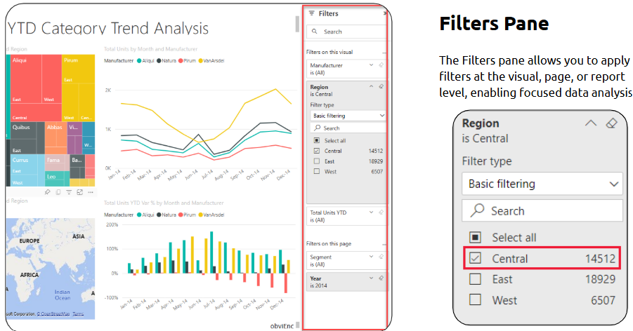
- Using slicers, filters, and bookmarks for interactivity
What is it?
These tools allow users to interact with data dynamically, narrowing or changing views on-the-fly without modifying the underlying data.
Where is it used?
Used in dashboards and reports to help viewers drill down or switch views easily.
How is it used?
• Slicers: Add a slicer visual to allow filtering (e.g., by date, region)
• Filters: Use visual-level or report-level filters from the Filter pane
• Bookmarks: Capture a specific state/view of a report for reuse or navigation
--- Takeaways / best practices
• Use slicers over dropdowns for better clarity
• Bookmarks are powerful for storytelling—combine them with buttons
• Always test interactivity for user experience before publishing
- Customizing visuals
What is it?
Customizing visuals refers to modifying chart aesthetics—such as colors, labels, titles, tooltips—to improve readability and match branding.
Where is it used?
Used across all Power BI dashboards and reports to ensure visuals are clean, professional, and user-friendly.
How is it used?
• Select a visual >
--- Takeaways / best practices
• Keep formatting consistent across visuals
• Use color strategically (e.g., red for loss, green for gain)
• Don’t overload with too many labels—balance clarity with simplicity
Example:
Let’s try to apply it!
Output:
Output:
- PowerBI Service and PowerBI Apps.
What is it?
Power BI Service is the cloud-based platform for sharing reports and dashboards; Power BI Apps are packaged sets of dashboards and reports shared with users.
Where is it used?
Used in organizations for publishing, scheduling refreshes, sharing dashboards, setting permissions, and accessing analytics on the go.
How is it used?
• Publish report from Power BI Desktop to Service
• Create a workspace to manage access
• Package dashboards into an App for distribution
• Set up automatic data refresh schedules
--- Takeaways / best practices
• Use Apps for organized, role-based access to reports
• Monitor usage metrics to see how users engage
• Maintain a schedule for refreshing datasets to ensure up-to-date insights
Topic 7: Complex Visuals and KPI Reporting
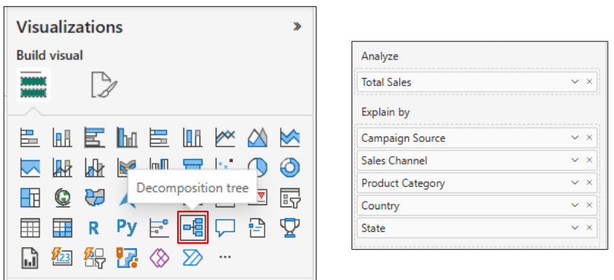
- Working with advanced visuals (Maps, Waterfall charts, Decomposition Tree)
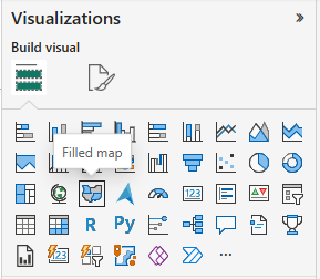
Power BI goes beyond basic charts—it helps you uncover powerful insights using visuals like maps, decomposition trees, combo charts, and KPI indicators.
What is it?
Advanced visuals are specialized chart types used to display hierarchical, geographical, or incremental data patterns.
Where is it used?
Used in dashboards that need to visualize geographic trends, analyze component-wise contributions, or break data down step by step.
How is it used?
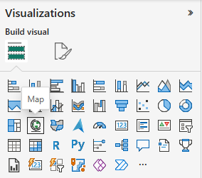
• Use Map visuals to represent geo-data like regions, sales territories
• Use Decomposition Trees to drill into categories like region → product → segment
• Use Waterfall charts to visualize profit breakdowns or value shifts
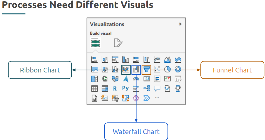
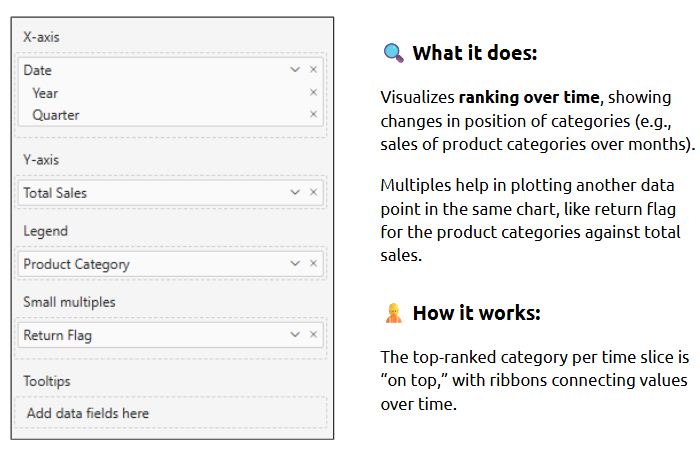
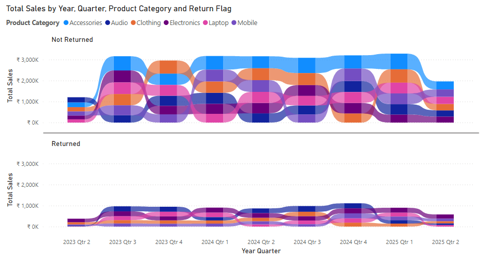
Ribbon Chart:
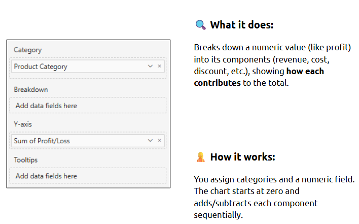
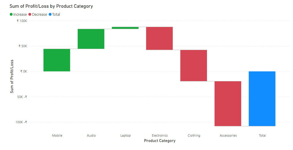
Waterfall Chart:
Funnel Chart:
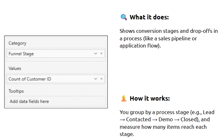
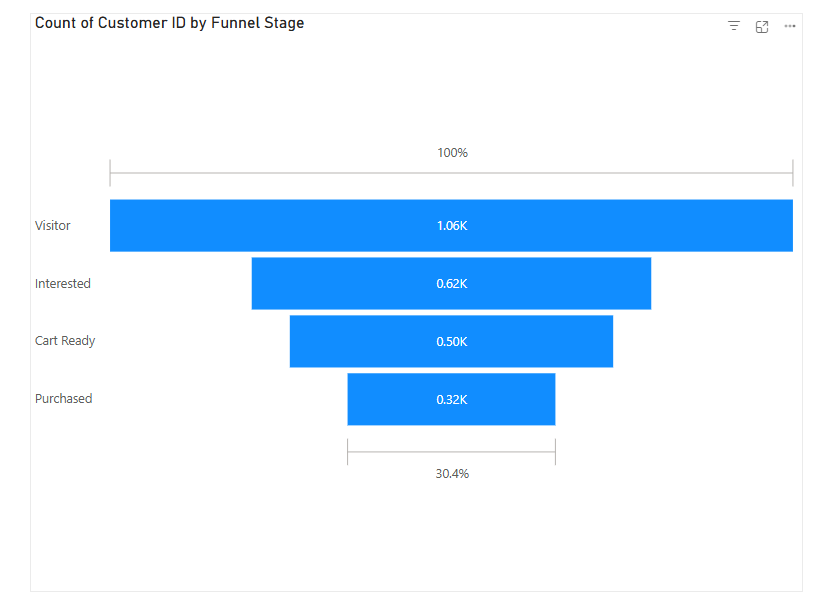
Takeaways / best practices
• Ensure accurate and clean location data before using maps
• Waterfall is great for showing start-to-end metric flow
• Use Decomposition Tree when exploring multi-level attributes
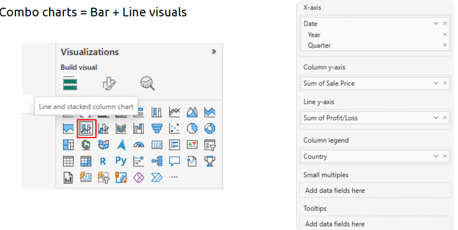
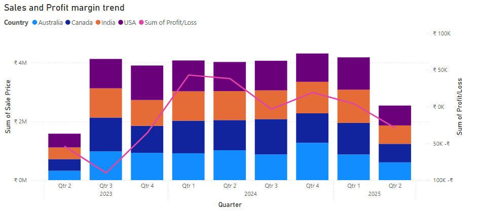
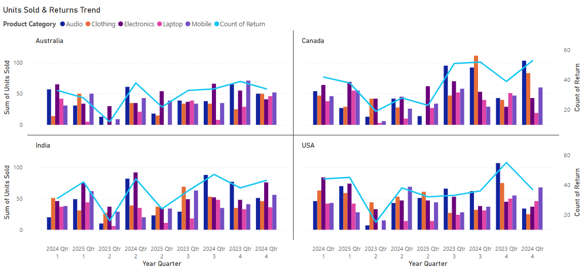
- Building combo charts
What is it?
A combo chart combines two different chart types (like column and line) to visualize multiple metrics in one visual.
Where is it used?
When comparing two related measures, especially with different units or scales—e.g., sales vs. profit margin.
Combo Chart 1:
Output:
Combo Chart 2:
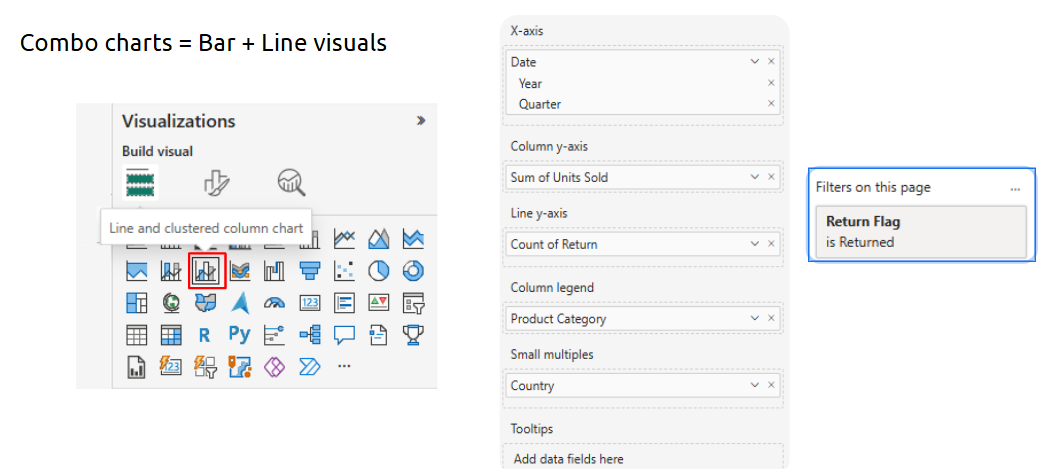
How is it used?
• Insert a Line and Clustered Column Chart
• Set one metric (e.g., Sales) for column, another (e.g., Profit Margin) for line
• Align axes and apply meaningful labels
Takeaways / best practices
• Combo charts are best for showing relationships between different types of metrics
• Always label axes to avoid confusion
• Use sparingly—only when dual comparison is meaningful
Topic 8: Introduction to Tableau & Basic Visuals
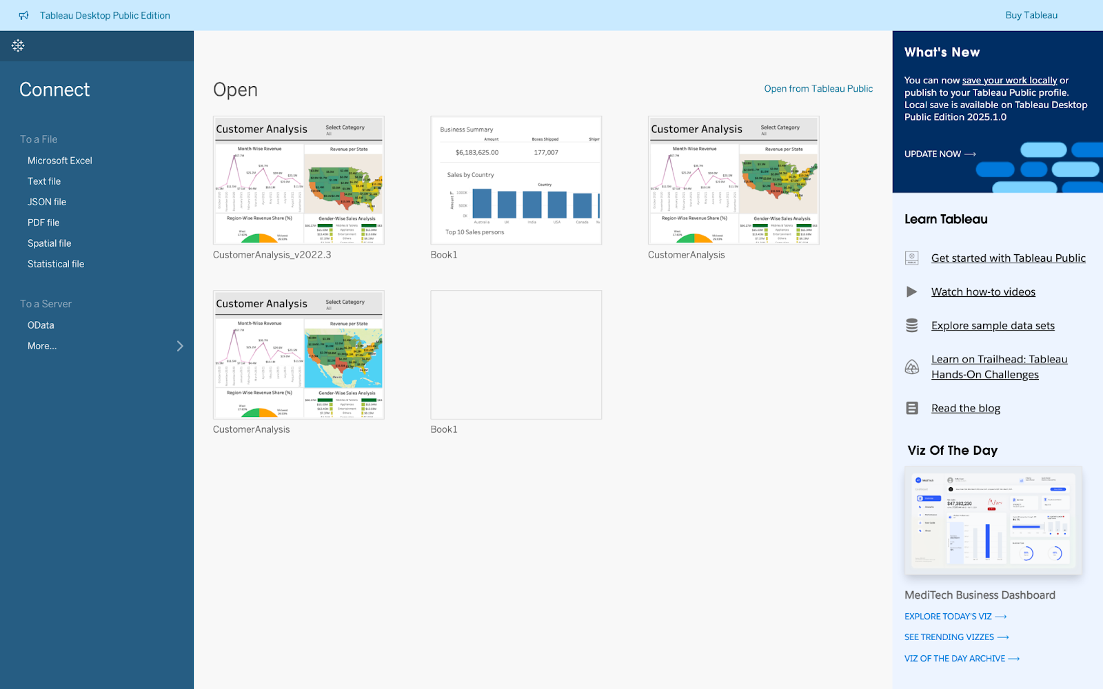
- Introduction to Tableau (Desktop, Server, Online)
Let’s get started with Tableau — a powerful tool that transforms raw data into insightful and interactive visualizations, making data storytelling more intuitive than ever.
What is it?
Tableau is a leading data visualization and business intelligence platform used to convert data into interactive dashboards and graphs.
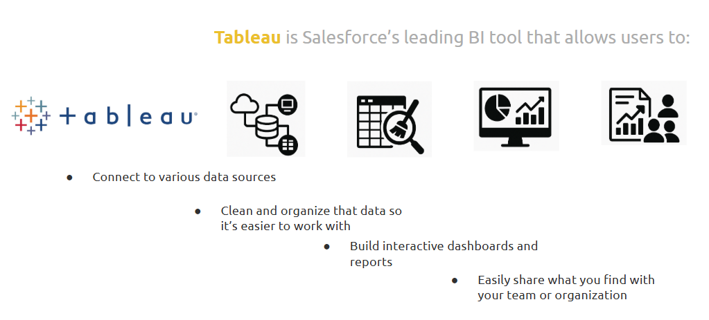
Where is it used?
Widely used in business intelligence, data analytics, marketing, finance, and consulting for creating visual reports and sharing insights.
How is it used?
• Tableau Desktop is used for designing reports and dashboards
• Tableau Server/Online is used to publish and share dashboards across teams
• Connect to various data sources and use drag-and-drop features to build visualizations
Takeaways / best practices
• Choose the right version based on your workflow—Desktop for building, Server/Online for sharing
• Always keep data connections updated for real-time insights
• Start small with basic dashboards, then scale to interactive and dynamic views
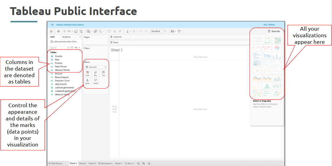
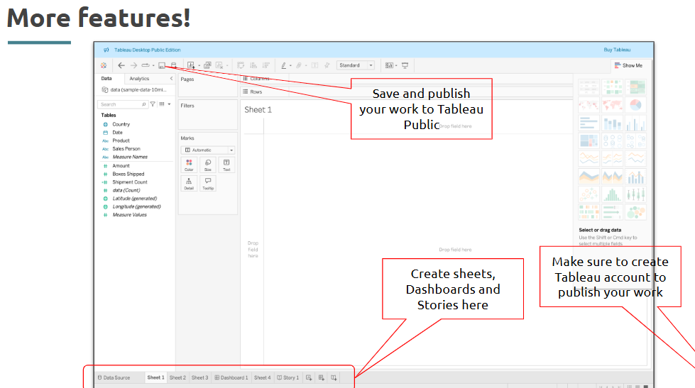
- Tableau Interface
What is it?
The Tableau interface includes shelves, cards, data pane, canvas, and toolbar—each part designed for intuitive visual building
Where is it used?
Used when designing dashboards and managing data connections within Tableau Desktop.
Let’s look at certain sections of Tableau before we jump directly into it:
Takeaways / best practices
• Familiarize yourself with the Data Pane and Marks card—it speeds up your workflow
• Use keyboard shortcuts and right-click menus to customize visualizations
• Name sheets clearly for organized dashboards
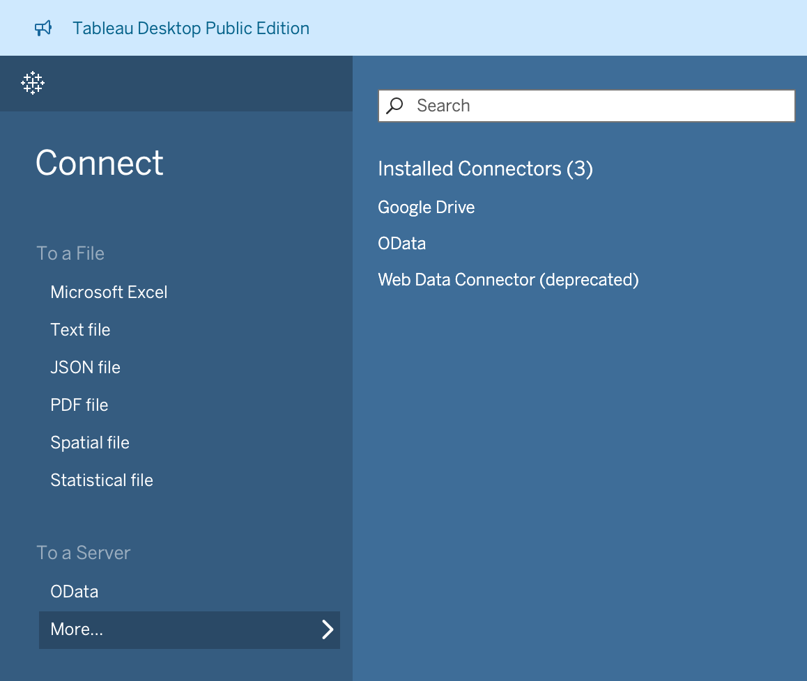
- Types of data sources
What is it?
Tableau connects to a wide variety of data sources, both live and static—ranging from Excel and CSV to SQL databases and web connectors.
Where is it used?
Used at the very beginning of the visualization process to import data into Tableau.
How is it used?
• Click “Connect” and choose from files (Excel, text), databases (MySQL, PostgreSQL), or servers (Google Sheets, Salesforce)
• Set connection type: live (real-time)
• Preview data and clean it in the Data Source tab
Takeaways / best practices
• Use live connections for dynamic dashboards; extract for performance optimization
• Clean data (e.g., rename columns, change data types) before building visuals
• Ensure field types are correct (e.g., Date, String, Integer) to avoid issues later
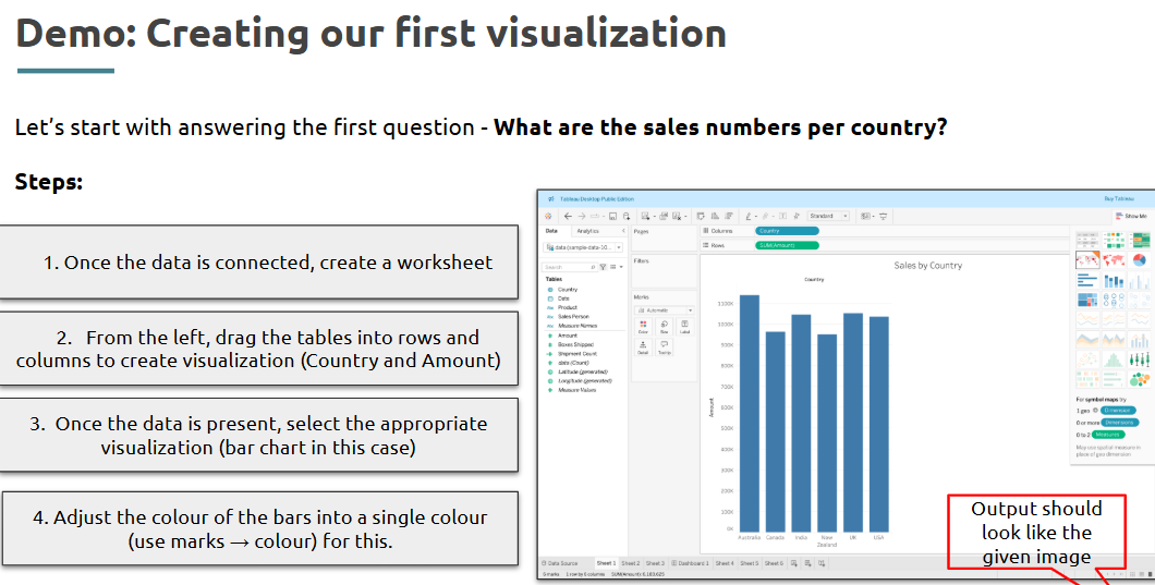
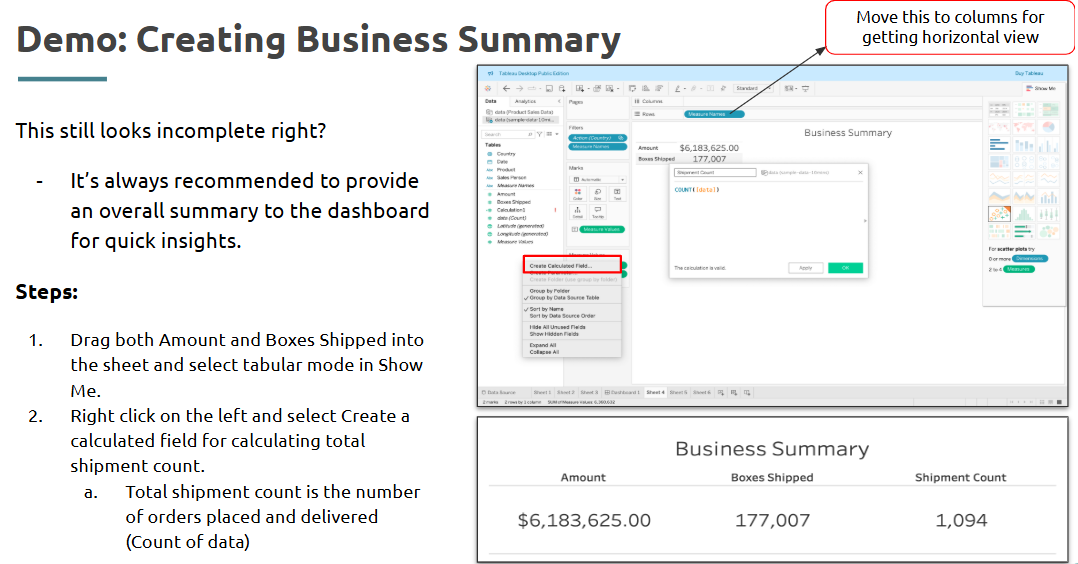
- Creating basic visualizations (Bar Chart, Line Chart, Pie Chart).
What is it?
Basic charts are the foundation of data visualization and help present comparisons, trends, and parts of a whole.
Where is it used?
Used in reports and dashboards to visualize KPIs, comparisons over time, and categorical distributions.
How is it used?
• Drag dimension to Columns, measure to Rows
• Use "Show Me" to choose desired chart type
• For bar chart: use discrete dimensions (e.g., Category) and continuous values (e.g., Sales)
• For line chart: add a date field on Columns and numeric measure on Rows
• For pie chart: drag dimension to Color and size the slices by a measure
Takeaways / best practices
• Use bar charts for comparison, line charts for trends, pie charts for proportions
• Avoid using pie charts with more than 4–5 segments for readability
• Leverage tooltips to enrich visuals without crowding them
Example:
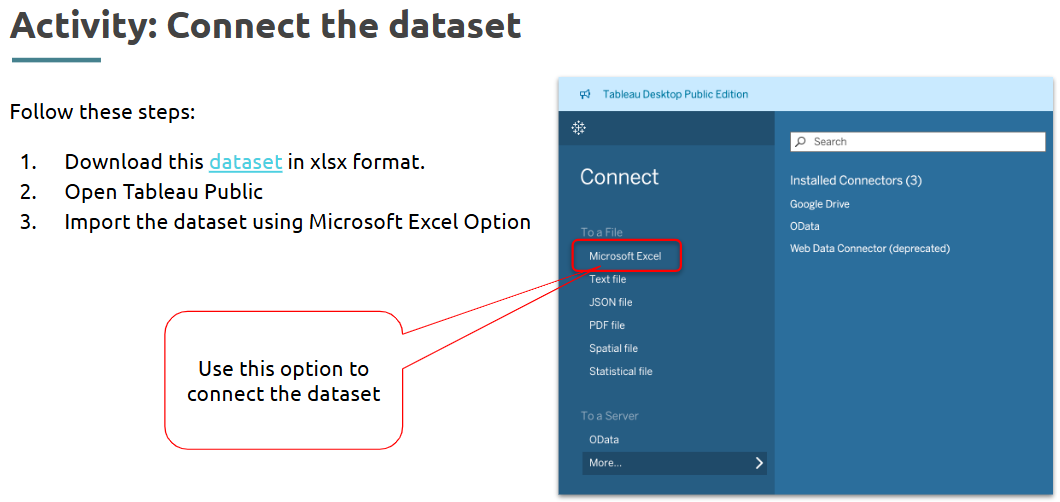
Introduction to our Problem statement:
Solution:
Download this dataset in xlsx format.
Find out Sales trend
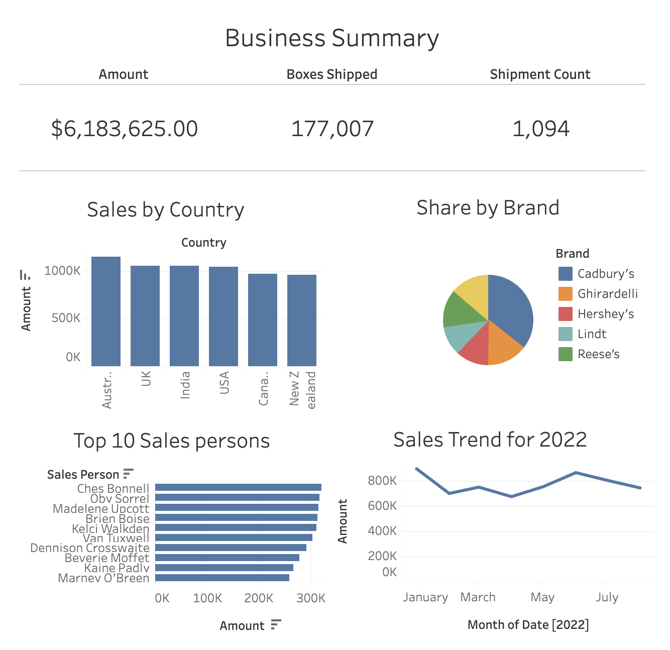
Final Dashboard:
Topic 9: Tableau Prep, Calculations & Aggregations
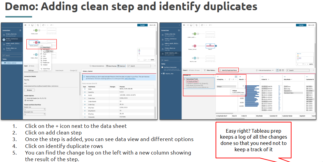
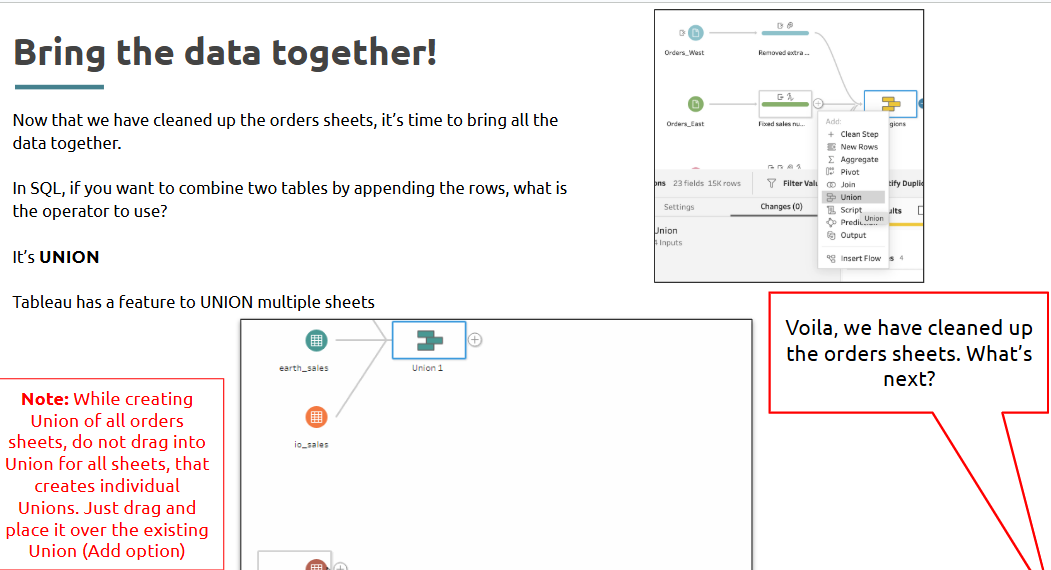
- Data connections and Tableau Prep basics
Jumpstarting your analysis begins with connecting your data correctly—Tableau Prep helps simplify and automate this process.
What is it?
Tableau Prep is a visual data preparation tool that allows users to clean, reshape, and organize data before visualization.
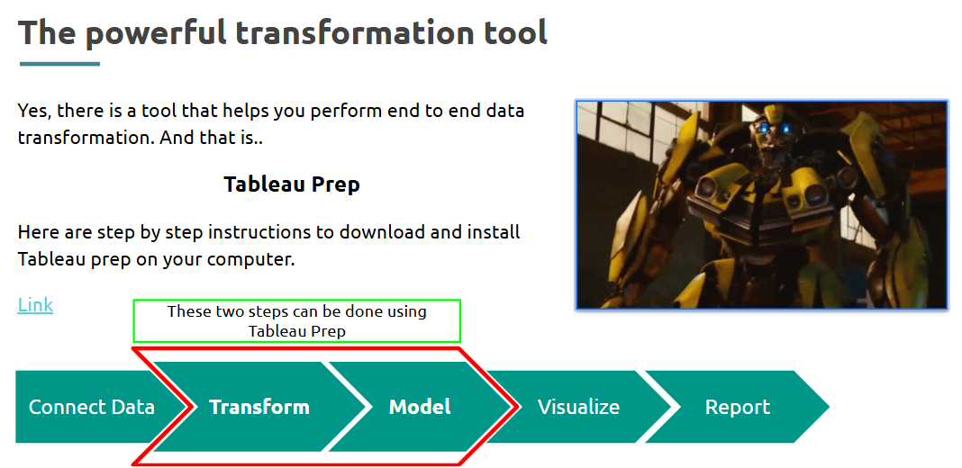
Tableau Prep Installation link
Where is it used?
Used when working with raw, unstructured, or messy data that needs cleaning before importing into Tableau Desktop.
How is it used?
• Launch Tableau Prep and connect to a data source (Excel, SQL, etc.)
• Drag tables to the flow pane
• Use cleaning steps to filter rows, rename columns, or change data types
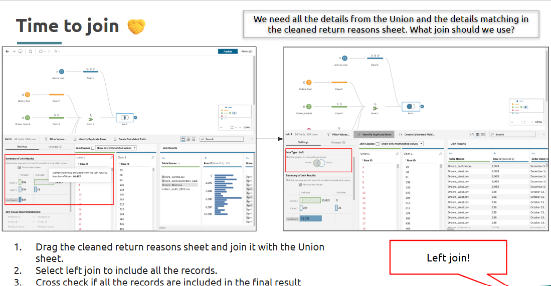
• Use joins and unions to combine data
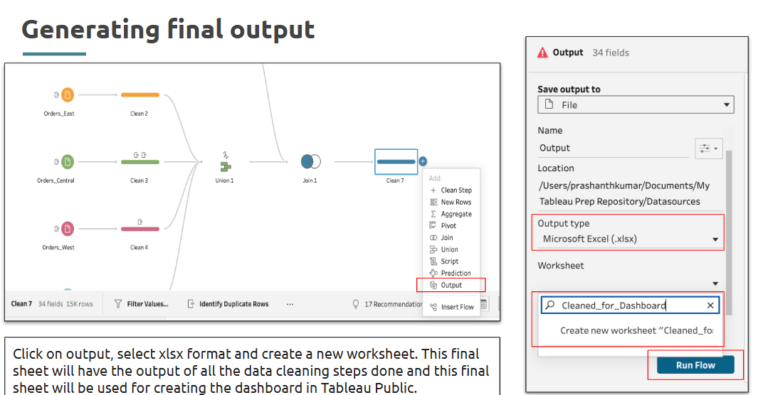
• Output the cleaned data to a .hyper file or Tableau extract
Takeaways / best practices
• Use Tableau Prep for repeatable, scalable data workflows
• Keep transformations simple and document logic clearly
• Validate changes by checking previewed output at each step
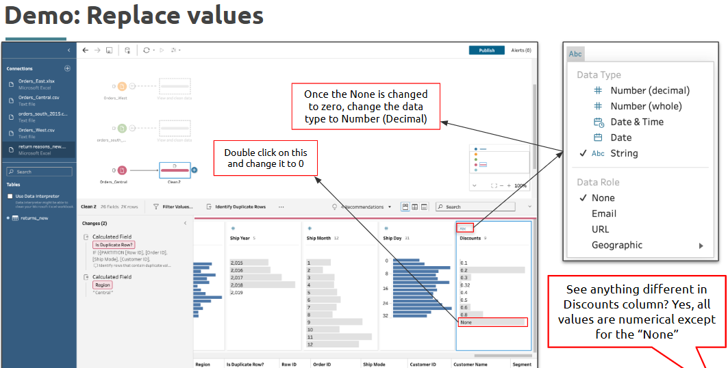
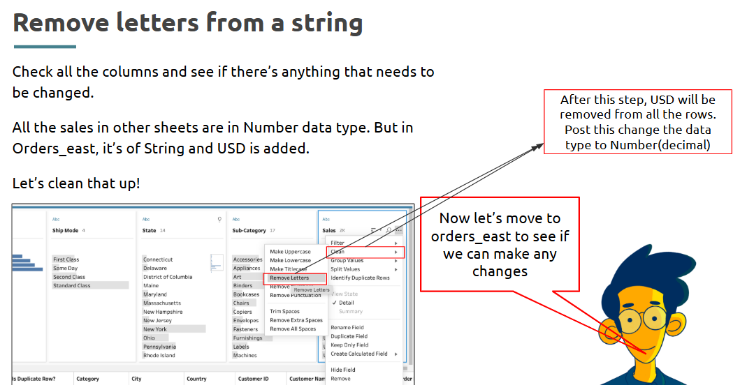
- Data cleansing
Clean data ensures trust in what you're visualizing—Tableau offers multiple tools to streamline this.
What is it?
Data cleansing involves removing inconsistencies, errors, and missing values from datasets to make them analysis-ready.
Where is it used?
Used during the initial data preparation phase to ensure reliability of visual outputs.
How is it used?
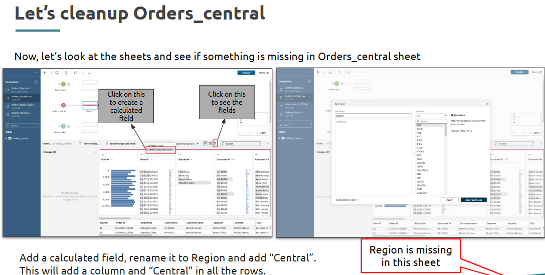
• In Tableau Prep: use clean step to rename fields, remove nulls, and format values
• In Tableau Desktop: manually filter out unwanted values or fix aliases
• Apply calculated fields to standardize values (e.g., converting "N/A" to NULL)
Takeaways / best practices
• Identify and address inconsistencies early
• Use group and replace to fix variations like “NY”, “New York”
• Clean once, reuse across dashboards for consistency
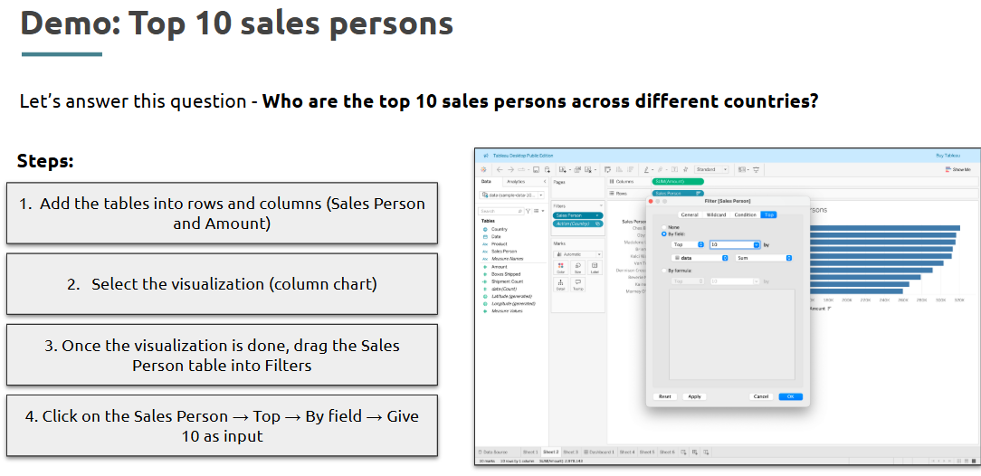
- Filtering & Sorting
Not all data is needed at once, filtering and sorting help users focus on what matters.
What is it?
Filtering allows you to limit the data shown based on certain criteria, while sorting arranges values in a defined order.
Where is it used?
Used across dashboards to refine views and enhance data storytelling.
How is it used?
• Drag fields to Filters shelf to apply conditions (e.g., show only 2023 data)
• Use Top N filters to show leading categories
• Click column headers to sort ascending/descending
• In dashboards, use interactive filters and dropdowns
Takeaways / best practices
• Filter data at the source if possible to improve performance
• Use context filters to create hierarchical filtering logic
• Combine filters with parameters for more user control
- Creating calculated fields
Sometimes raw data isn’t enough—you need custom logic to reveal deeper insights.
What is it?
Calculated fields are user-defined expressions used to derive new values from existing data in Tableau.
Where is it used?
Used when transforming columns or creating new metrics within Tableau Desktop or Prep.
How is it used?
• Right-click in Data Pane > Create Calculated Field
Takeaways / best practices
• Test calculated fields on small datasets first
• Use meaningful names for easier maintenance
• Encapsulate logic in parameters for reusability
Topic 10: Advanced Tableau Visualizations & Interactivity
- Creating complex visualizations (Heatmaps, Tree Maps, Bullet Graphs)
Sometimes your data tells a stronger story when visuals do more than just bars and lines.
What is it?
Complex visualizations like heatmaps, treemaps, and bullet graphs are advanced chart types that help convey patterns, proportions, and performance benchmarks.
Where is it used?
Used in dashboards where comparison, performance tracking, and distribution are critical—especially in business reporting and exploratory data analysis.
How is it used?
• Heatmap: Drag one dimension to Columns, another to Rows, and a measure to Color
• Treemap: Select Treemap from Show Me panel and assign dimension and measure
• Bullet Graph: Use dual-axis chart with actual value, target, and performance bands
Takeaways / best practices
• Use color gradients thoughtfully—avoid overly saturated schemes
• Treemaps are great for showing parts of a whole but avoid using too many small segments
• Bullet graphs help communicate performance toward goals effectively
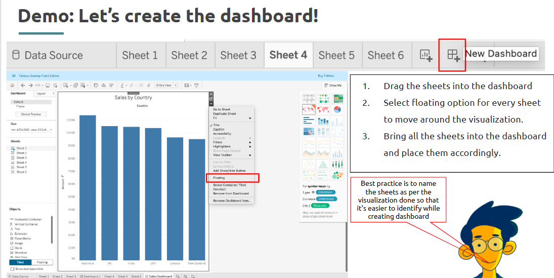
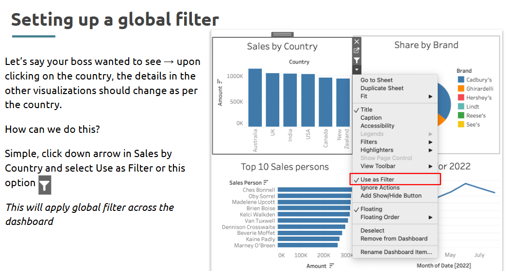
- Interactive Dashboards.
An effective dashboard doesn't just display—it invites interaction.
What is it?
Interactive dashboards allow users to explore data using filters, tooltips, parameters, and drill-downs.
Where is it used?
Used in executive reports, business presentations, and self-service analytics portals.
How is it used?
• Combine multiple sheets into a dashboard
• Add filters and link them across charts
• Use actions (filter, highlight, URL) to trigger interactivity
• Insert parameters for user-defined inputs
• Enable device-specific layouts
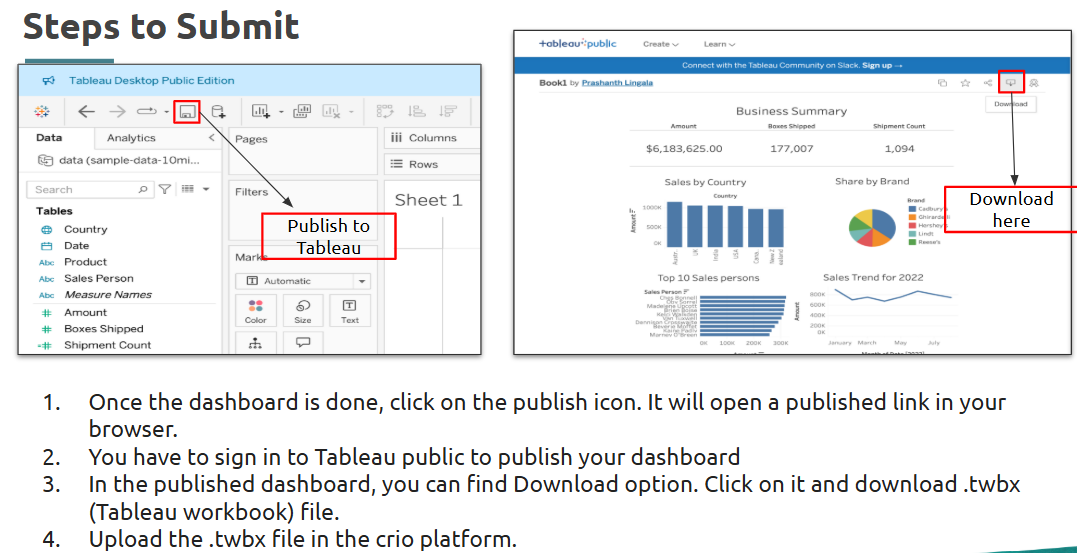
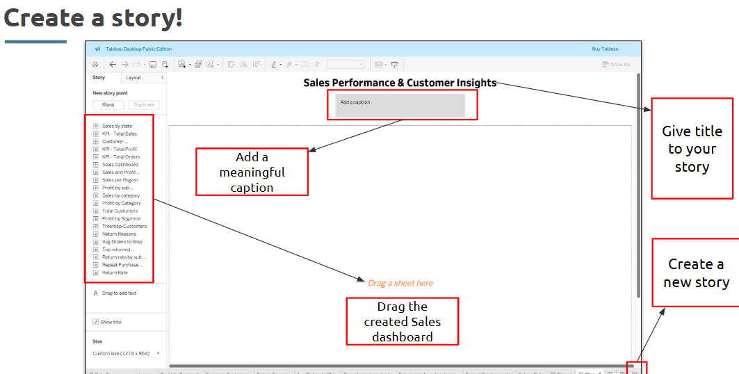
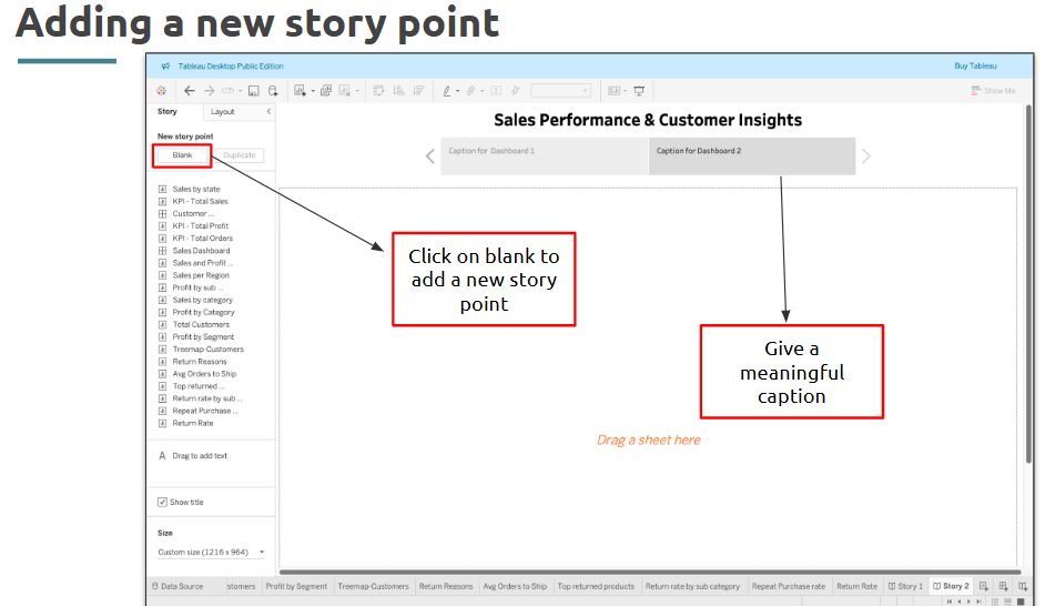
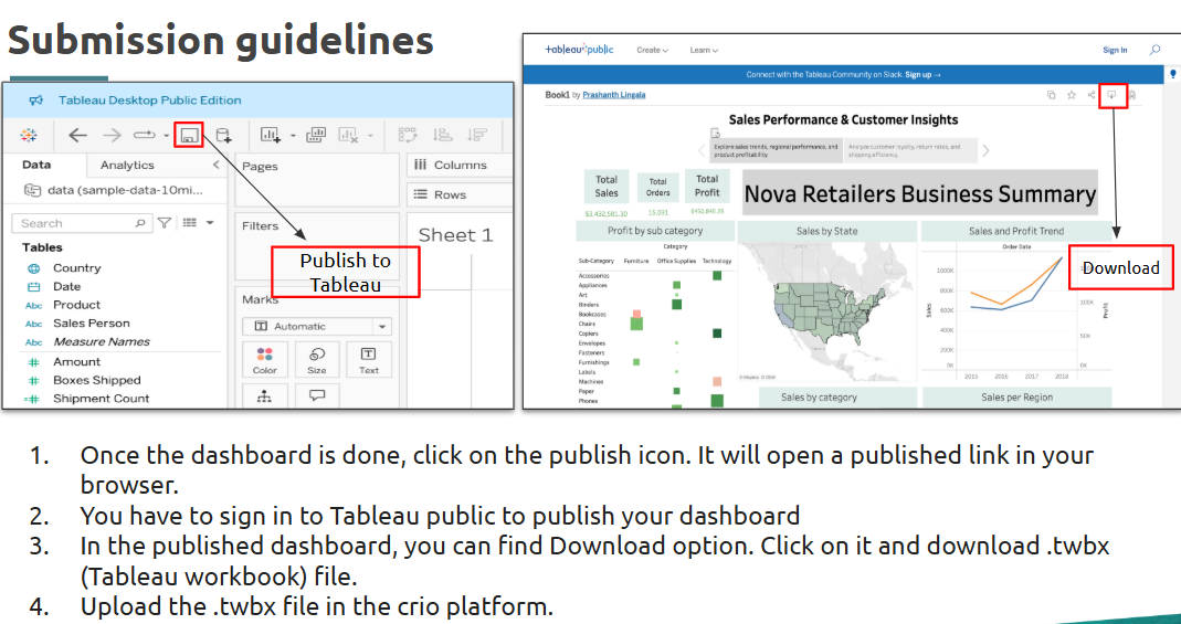
Create a story and publish
Takeaways / best practices
• Design with user flow in mind—use interactivity to guide exploration
• Include clear legends, titles, and tooltips for context
• Limit complexity to prevent overwhelming the viewer
-Interview Resources
Top 40+ Power BI Interview Questions And Answers : Link
Power BI Interview Questions for Freshers & Beyond : Link
Was this article helpful?
That’s Great!
Thank you for your feedback
Sorry! We couldn't be helpful
Thank you for your feedback
Feedback sent
We appreciate your effort and will try to fix the article